
SAPI
SAPI is a community-driven marketplace where members can buy and sell delicious homemade food from local neighbors. The platform fosters a sense of connection, trust, and mutual support within the community—empowering people to share their culinary talents while bringing neighbors closer together.
My role in this project
Research & User Insights
To deeply understand user needs, I conducted surveys, interviews, and empathy mapping, among other methods. This research helped uncover key pain points and motivations, forming the foundation for a user-centered product strategy.
Visual Language & UI Kit
I established a cohesive visual system that included color schemes, typography, and custom illustrations. This UI kit ensured consistency across the app and provided a clear framework for future design iterations.
Usability Testing
Using a clickable Figma prototype, I ran usability testing sessions and gathered detailed feedback. The results, documented in usability reports, guided design improvements and validated our solutions before development.
🍔
🥙
🍰
Surveys and Interviews
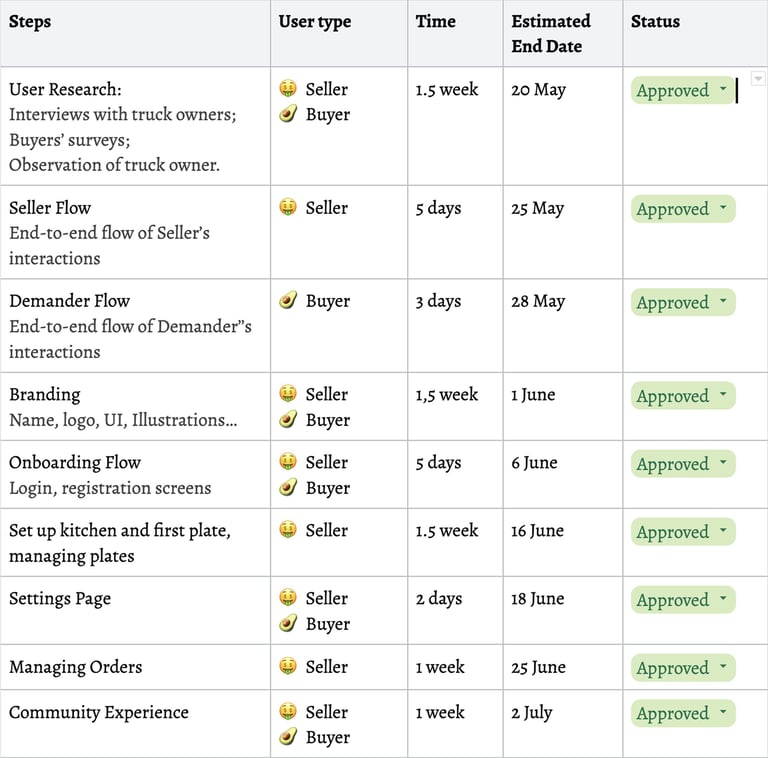
To begin my research I started with user surveys and interviews. I invited potential sellers to participate in the survey and potential sellers to spend some time with me on 1-1 interviews. The results were presented to the client in the form of reports with all my findings:


Survey Results
Interview Insights
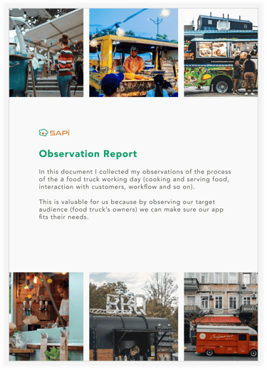
Observation Report
Next, I wanted to get knowledge of what difficulties sellers run into daily and what their routine looks like. I was lucky enough to have an opportunity to observe Peter (owner of the food truck) and I collected my observations of the process of the а food truck working day (cooking and serving food, interaction with customers, workflow, and so on).
The following report was presented to the client:

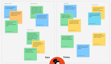
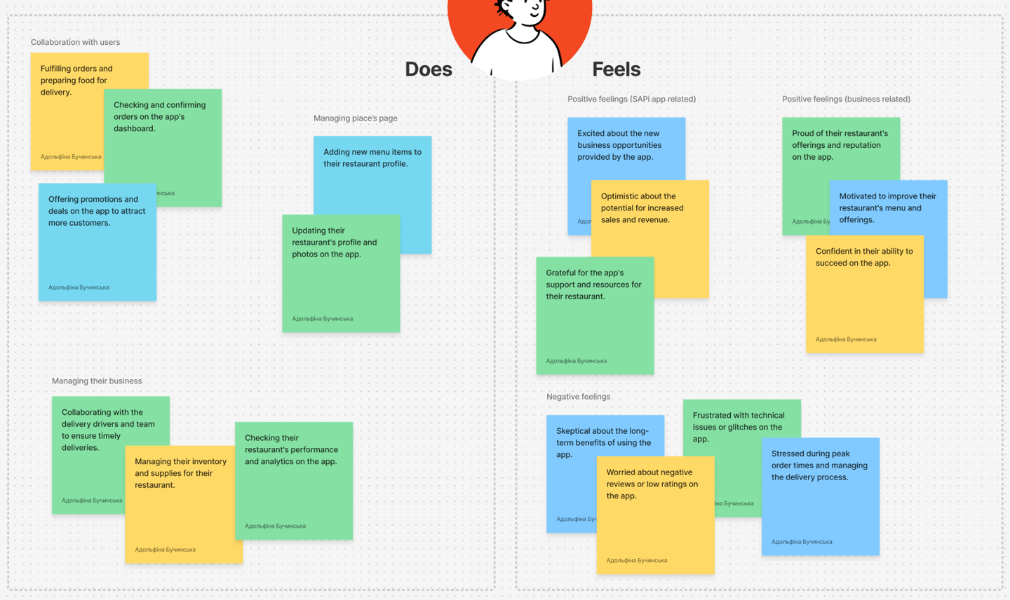
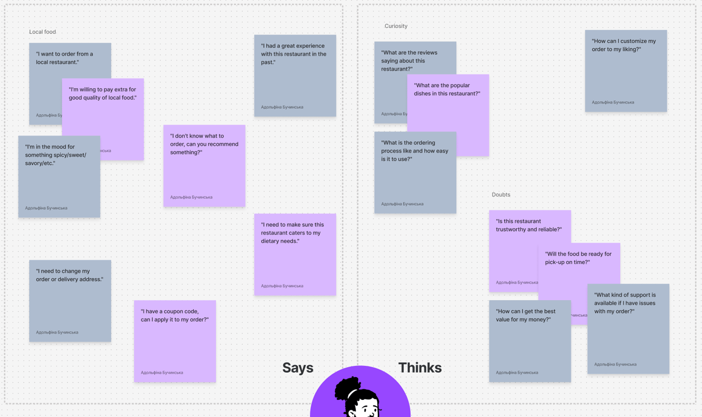
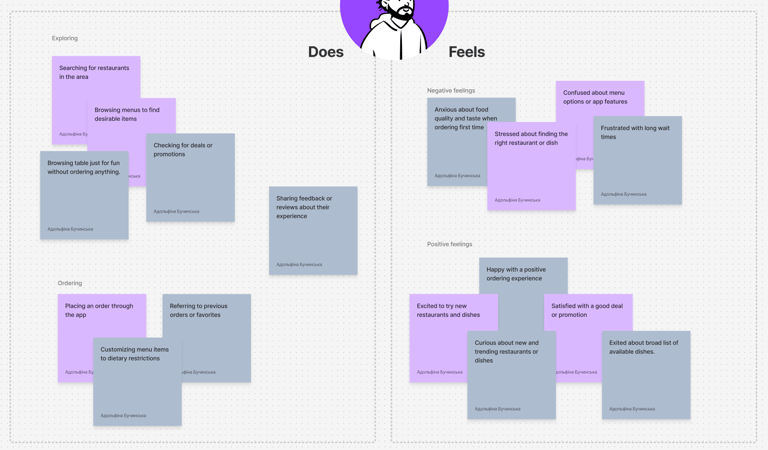
Empathy map
To emphasize more with the users I created an empathy map for both (seller and buyer), based on insights from interviews and surveys:


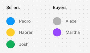
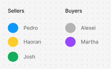
User personas
Based on interviews and surveys I outlined 4 different users personas I found:
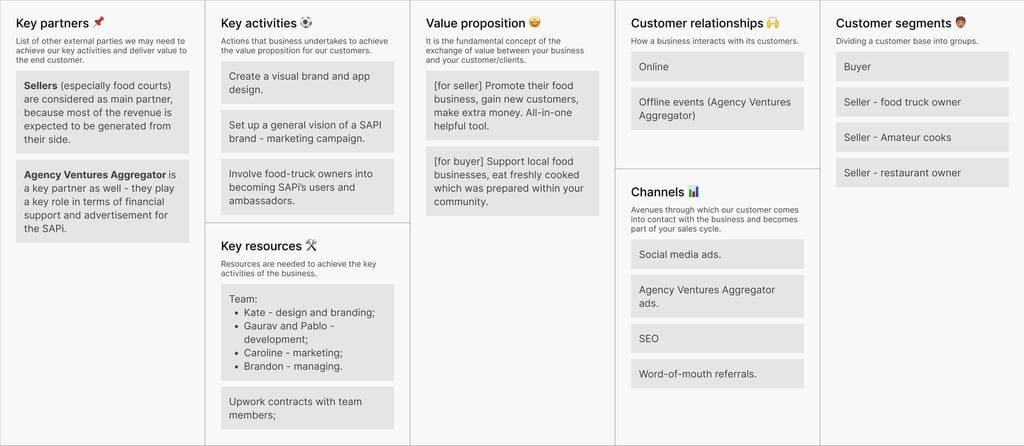
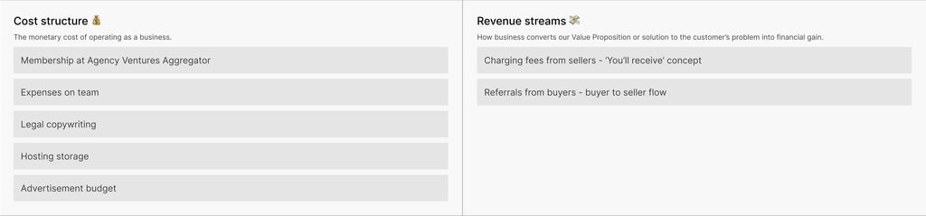
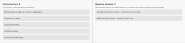
Business Canvas model
Before starting the sprint I suggested we think about our business model, so together with the startup owner I created a Business Canvas Model schema:
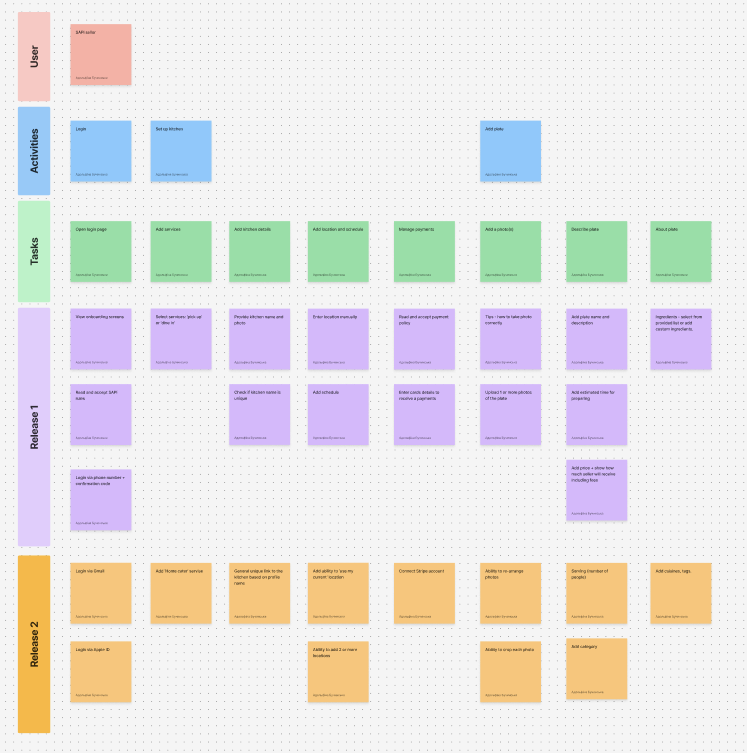
User story mapping
Based on a discussion with the Startup Owner and Head of Dev team we divided functionality into phases. I created a user story map board, so we have a visual representation of what is included in the first release and what’s not. This helped us to be focused on one step at a time and have a clear roadmap for the future.

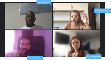
Team and Collaboration
During all that time I was collaborating with the team, which consisted of the Head of Marketing, the Startup Owner, and the Head of the Dev Team. I was planning the meetings and kept our conversation user-centric.

Colour schema and illustrations
1) Creating sketches


At the beginning of my work, I sketched an images, which we’ll place on the onboarding screens.
2) Presenting design styles
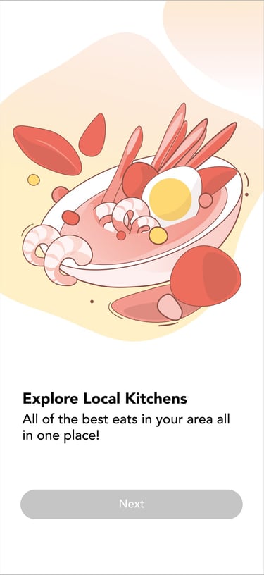
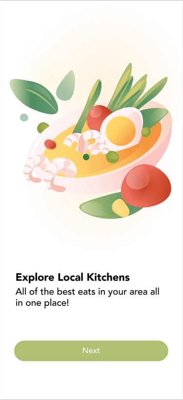
After we agreed what need to be depicted on the illustrations I presented three different style. Having thought about it, customer choose first one
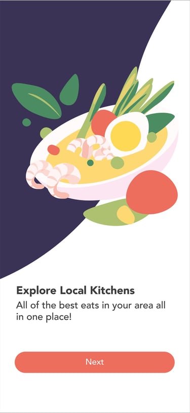
Option 1 ✅
Option 2
Option 3
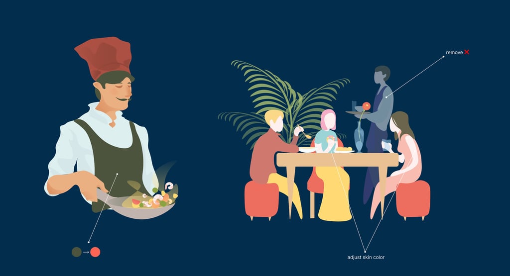
3) Illustrations in progress
When color schema and style is selected I began to draw remaining illustrations. During this process I made some adjustment to my initial drawing based on customer’s feedback, for example changing skin color of characters.

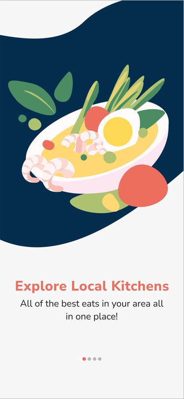
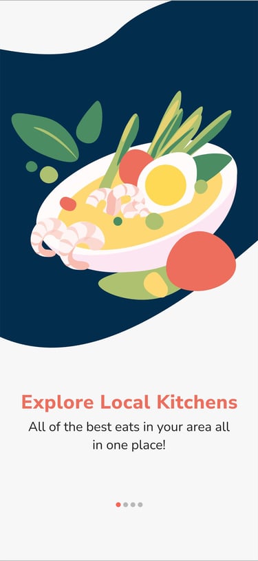
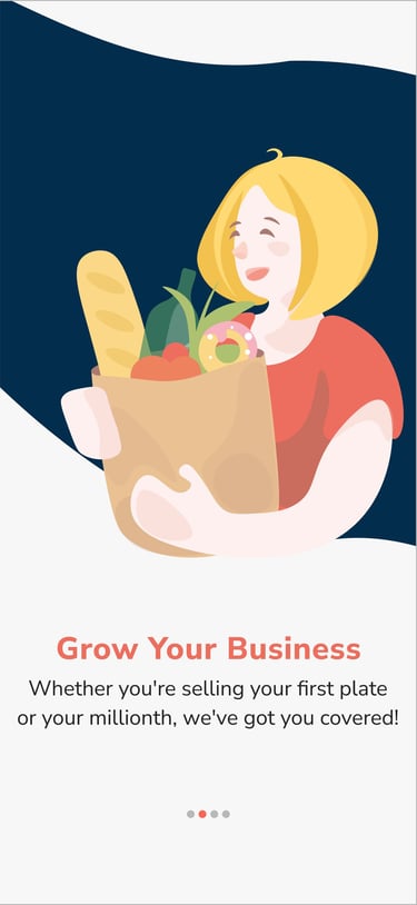
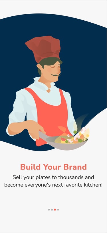
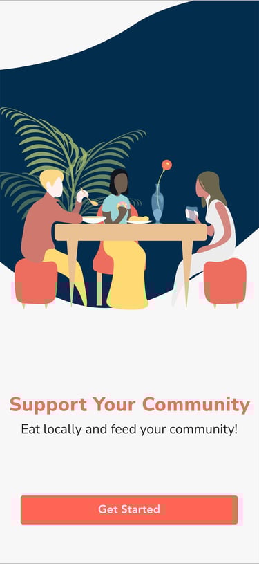
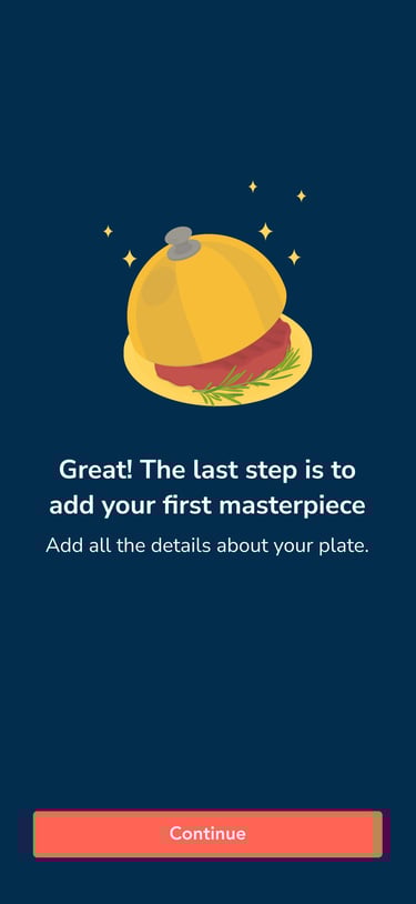
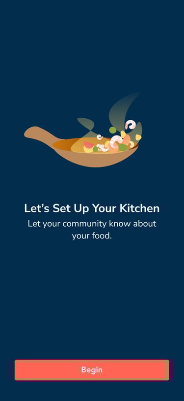
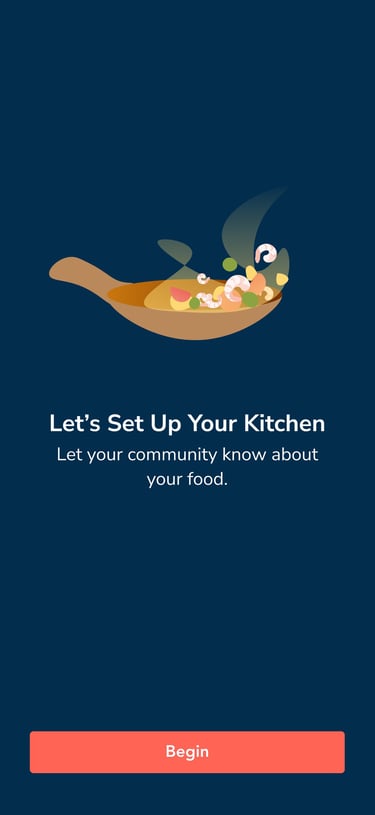
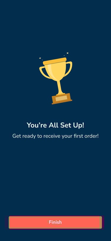
4) Final Screens
As a result, I created these four illustrations. They were used for onboarding screens.

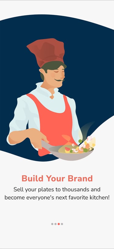

5) Other SAPi illustrations
As we go, I continued to create illustrations within selected style and colors.


Conclusions & Reflextion
What Was Done
For this project, I focused heavily on the UX process — conducting user interviews and surveys, building empathy maps and personas, and delivering a wide range of user experience artifacts to guide the design.
These deliverables helped shape the product’s direction and ensured that every decision was backed by real user insights.
✅
⏳
What Could Be Improved with More Time
With more time, especially after the app’s launch, I would have the opportunity to gather richer data from real users. This would allow me to run additional usability tests, track user behavior in real-world scenarios, and continuously improve the app based on actual feedback and analytics.