
Vintage Market
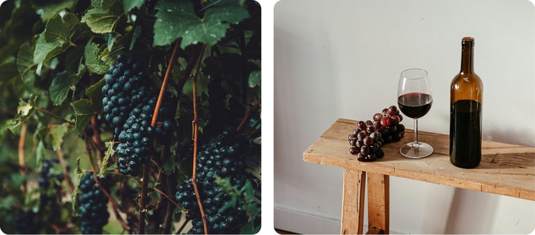
Vintage is a high-end online retailer specializing in premium alcoholic beverages — wine, spirits, champagne — with an emphasis on quality, exclusivity, and exceptional customer experience. The goal was to create a luxury brand feel, streamline discovery, and facilitate trusted purchase decisions for discerning buyers.
My role in this project
Branding from scratch
Developed the full visual identity, including logo, color palette, typography, and brand guidelines to establish a distinct luxury feel.
UX/UI Design
Designed the complete customer journey — from product discovery and filtering to checkout. Created a scalable design system for consistency across the platform.
User Testing
Conducted iterative testing sessions to validate flows, ensure clarity, and refine pain points in navigation and checkout.
🍷
🍇
🍾
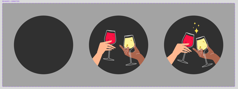
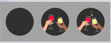
Prototypes
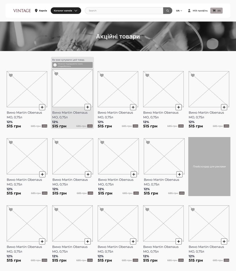
To establish the foundation of the Wine Market experience, I began with low-fidelity prototypes. This allowed me to quickly explore layout options, define the placement of key elements, and test different user flows. Sharing these prototypes with stakeholders helped align expectations early, validate the structure, and set a clear direction before moving into detailed design.

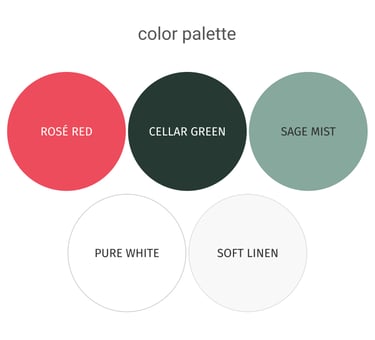
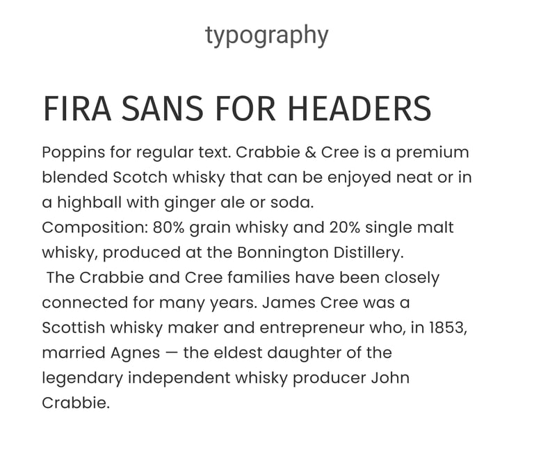
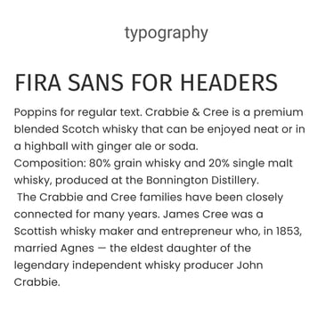
Branding
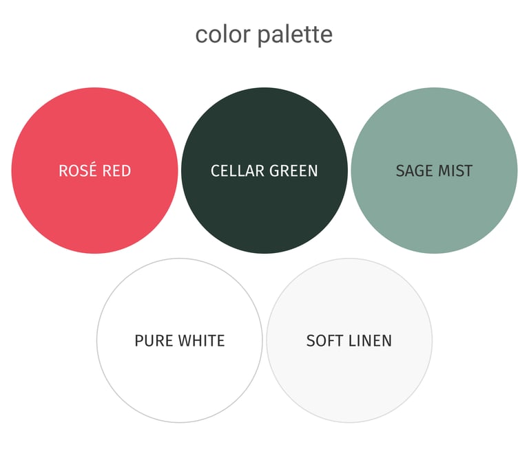
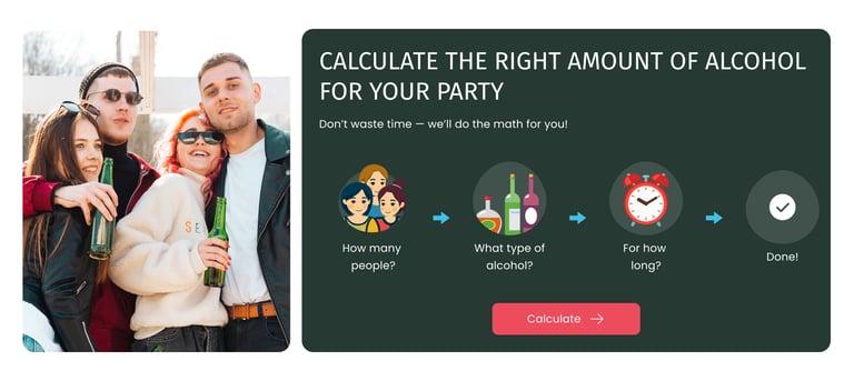
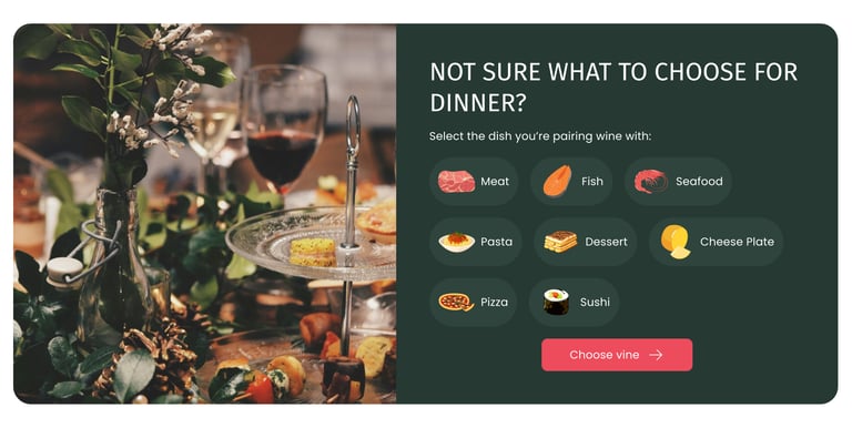
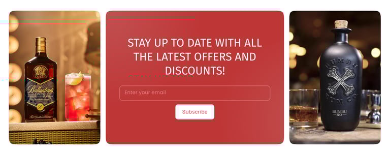
For the Wine Market brand, I selected a deep, rich forest green for backgrounds to convey sophistication, elegance, and the premium feel of fine wines. For call-to-action elements, I chose a rosé-red — a warm, pinkish-red hue that evokes the subtle tones of rosé wine, draws attention without being harsh, and creates a sense of approachability and luxury. Together, these colors reinforce the wine-inspired identity while guiding users’ focus throughout the experience.

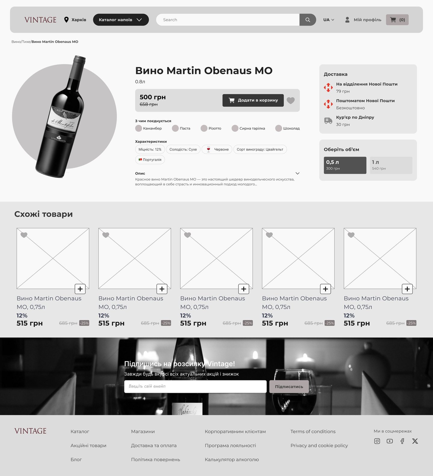
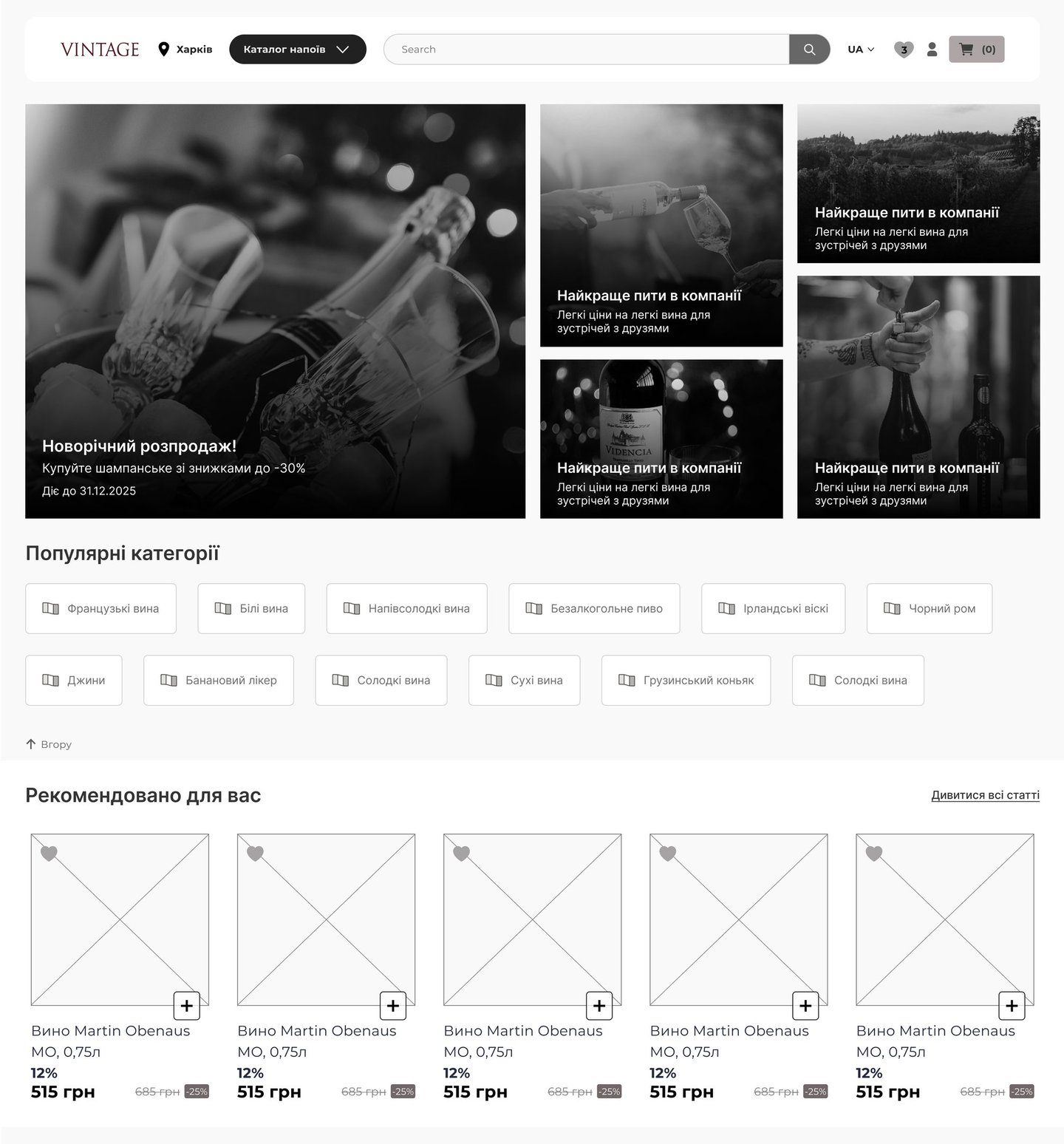
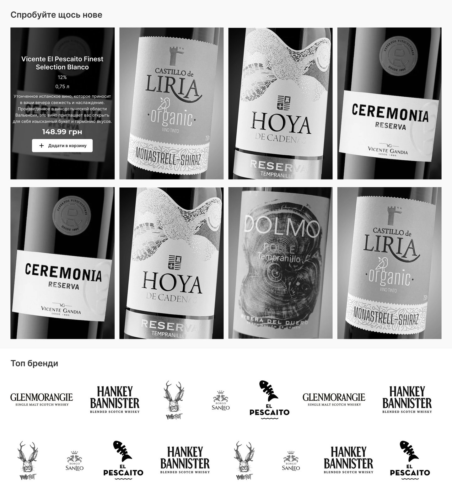
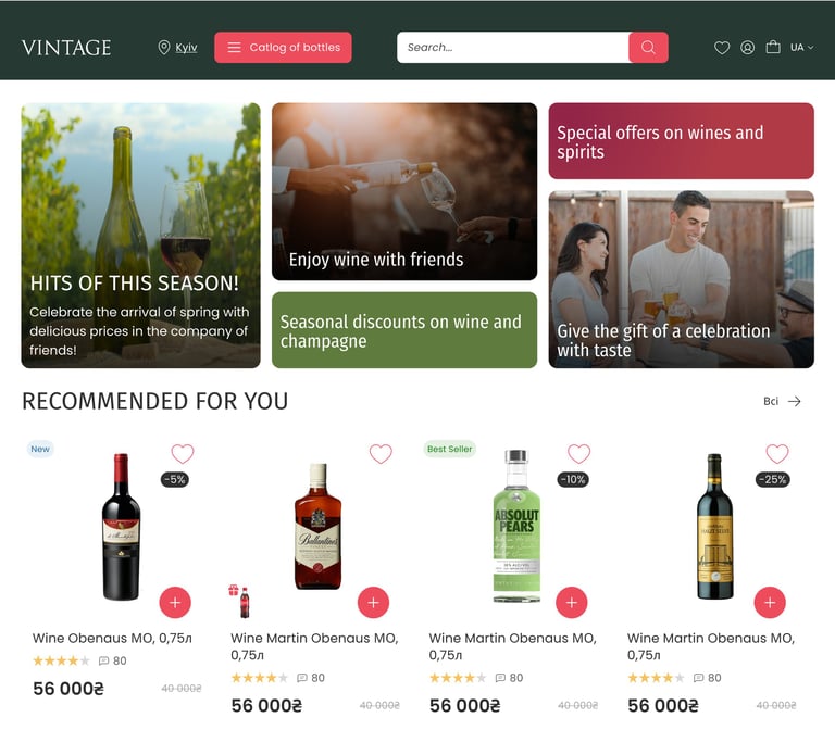
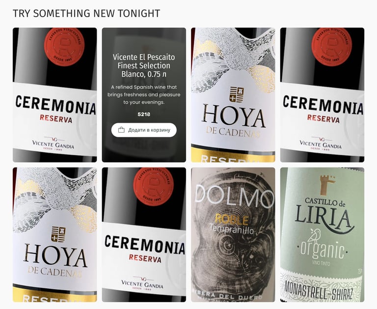
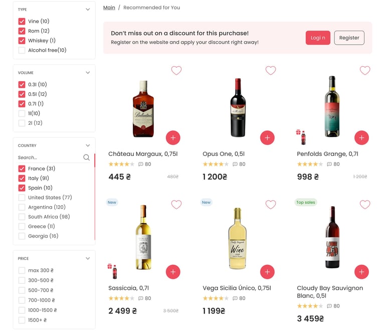
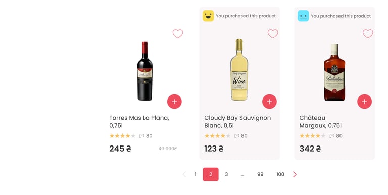
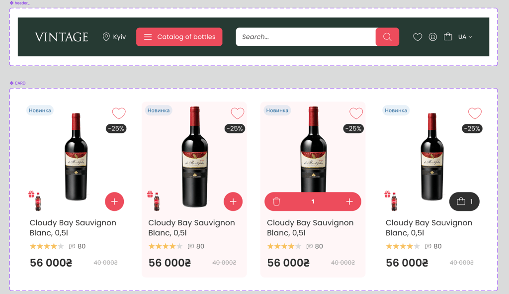
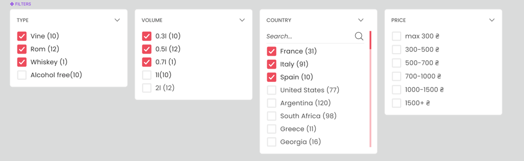
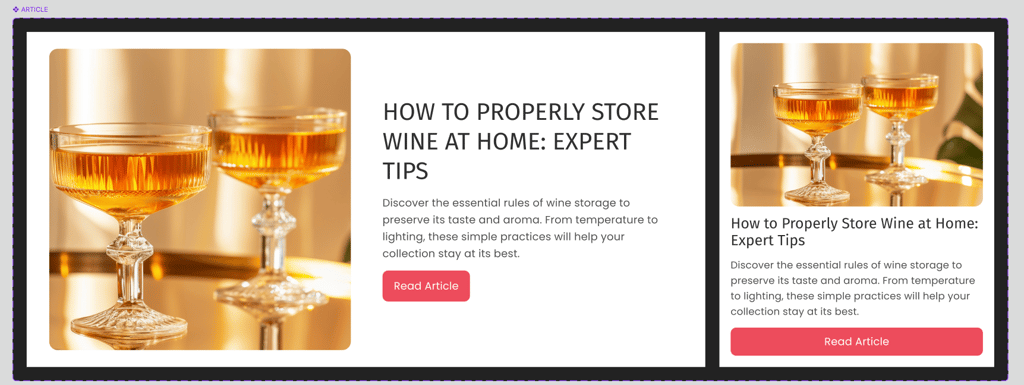
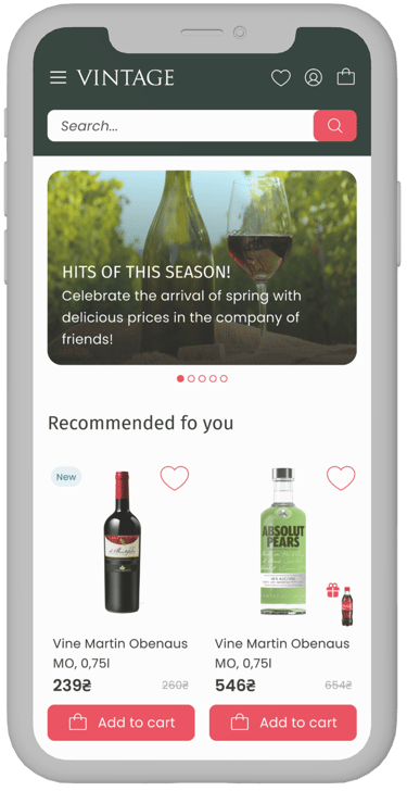
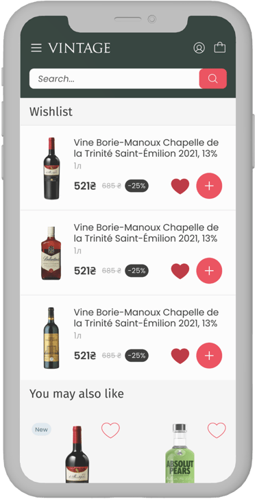
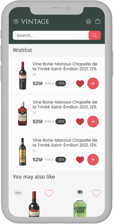
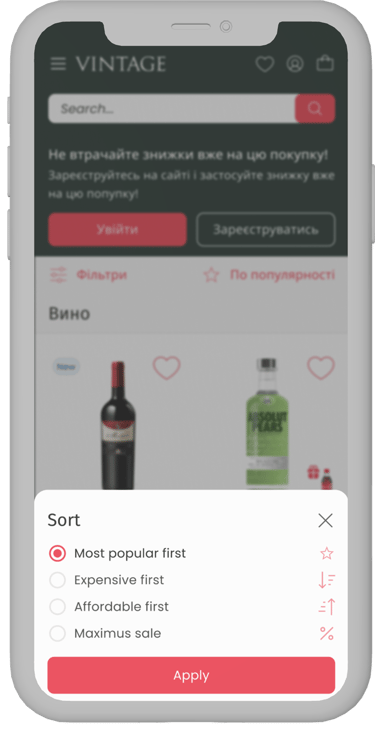
Designs
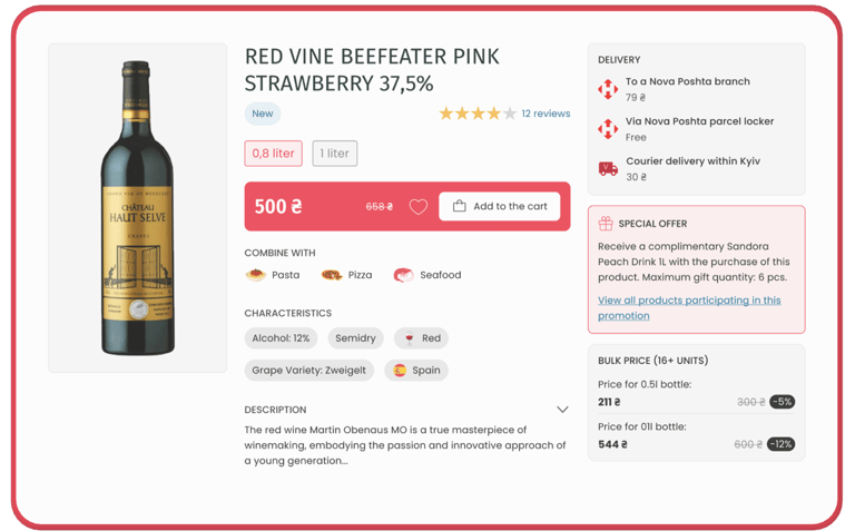
This section presents the final high-fidelity designs, including branding, typography and color. Here I demonstrate how concepts evolve into complete, production-ready user interfaces.


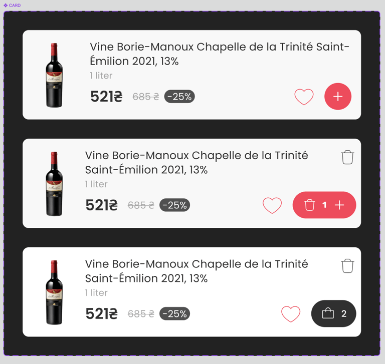
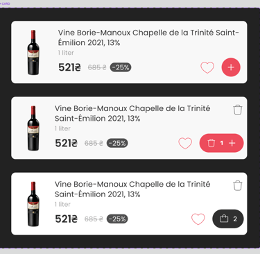
A/B Testing
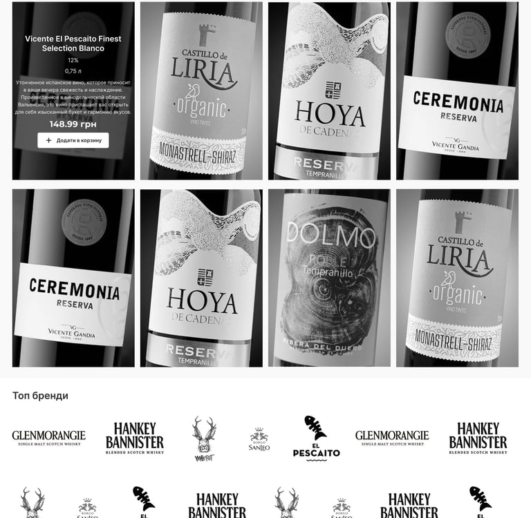
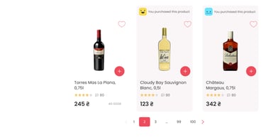
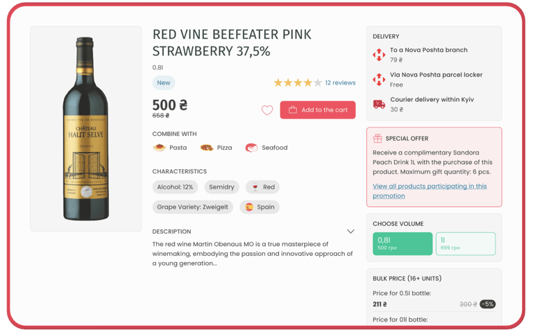
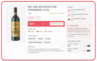
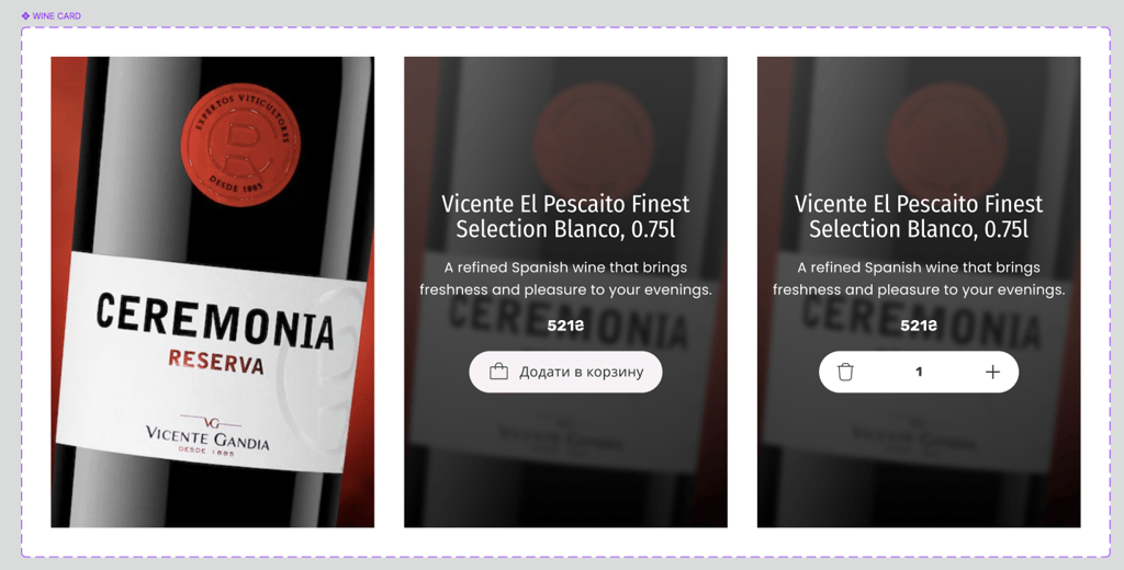
To optimize the product card experience, I designed two variations and conducted user testing to identify which layout performed better in terms of clarity, usability, and engagement. I hypothesized that Version B, with a more prominent ‘Add to Cart’ , would drive faster decision-making compared to Version A.
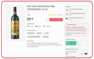
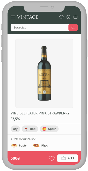
Option A — Client’s Preference
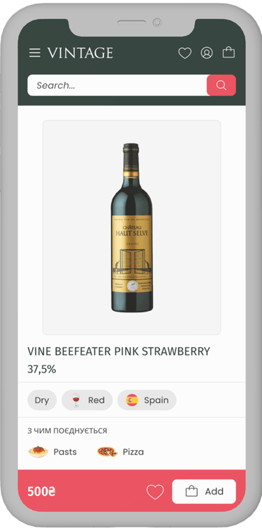
Option B — My proposal
This version reflected the client’s initial vision. The layout kept a more restrained visual hierarchy, with the product price displayed in a neutral style and the volume selection placed on the right side of the screen. While this approach maintained a clean structure, it required users to shift their attention across the layout to choose the volume of the bottle.
User testing showed that only 15% of respondents selected Option A
In this variation, I emphasized the price as a central decision-making element, highlighting it with a subtle rosé background to draw attention without overwhelming the design. The volume selection was placed directly above the price, allowing users to view and adjust both key details in one glance, reducing the need for eye movement across the interface and supporting a smoother decision flow.
The majority (85%) chose Option B as the more convenient layout.
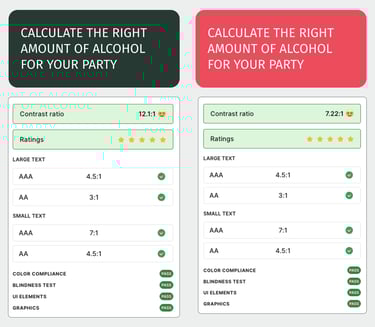
Accessibility & Usability
I applied WCAG guidelines to ensure the platform is inclusive, with readable type, sufficient contrast, and accessible interactive elements.
There were no specific accessibility requirements for this project, but I know how important it is. I used a Figma plugin to test the two primary colors, and they successfully passed AAA compliance standards.

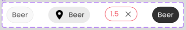
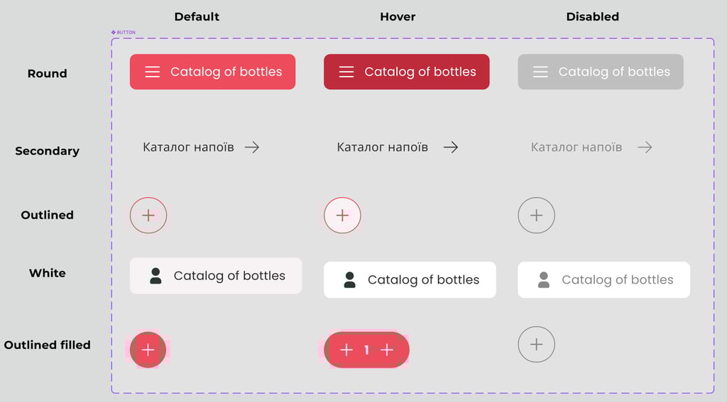
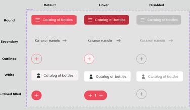
Design System
To ensure consistency and scalability, I created a design system with reusable components, color tokens, and typography rules. This not only streamlined the design process but also simplified developer handoff and guaranteed a cohesive user experience across all screens.


Responsive Design
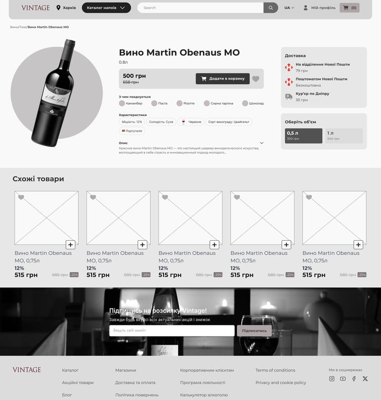
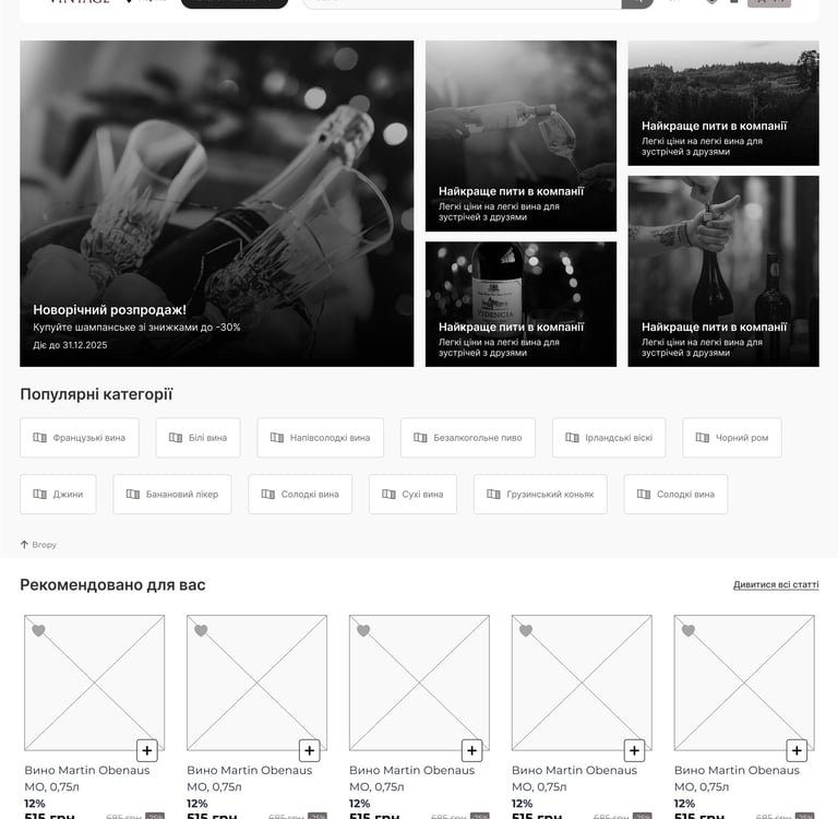
Since a large portion of users shop from mobile devices, I designed fully responsive layouts for all key pages. Using flexible grids, scalable components, and optimized touch targets, I ensured that the experience remains intuitive and elegant across desktop, tablet, and mobile. This approach guarantees usability without compromising the premium feel of the brand.


Conclusions & Reflextion
What Was Done
In this project, I combined my expertise in branding, color theory, UX strategy, and UI execution to design a premium e-commerce platform. The process included developing a visual identity and design system, creating prototypes, conducting user testing, and refining layouts into polished, ready-to-develop screens. Each step reflected my ability to balance client expectations with user needs, ensuring both usability and a strong brand presence.
See the site live
✅
⏳
What Could Be Improved with More Time
If given more time, I would expand testing to explore how different color accents, typography choices, and micro-interactions impact user perception. I would also design tablet-specific adaptations to optimize the experience on mid-sized screens, bridging the gap between mobile and desktop.
Additionally, I would run further iterative usability sessions to validate finer UI details, ensuring that every interaction supports both accessibility and a seamless customer journey.