TEN
TEN is a business-platform for the esports and video gaming industry, built to connect companies, professionals, and service providers in a B2B ecosystem. It provides a directory of esports and gaming businesses, a marketplace to provide or order services, job listings, candidate profiles, and tools for promotion and communication.
My role in this project
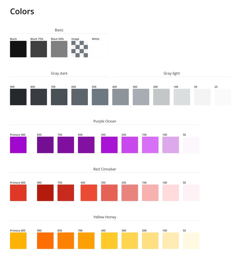
Branding from scratch
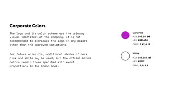
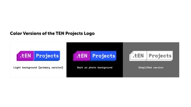
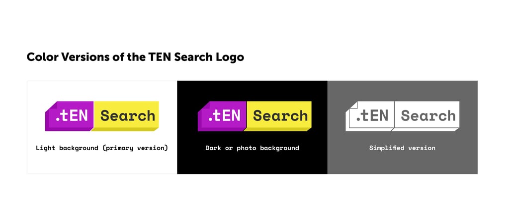
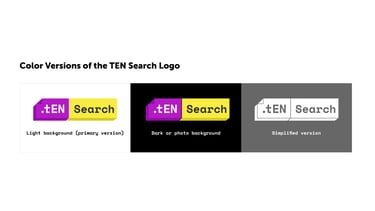
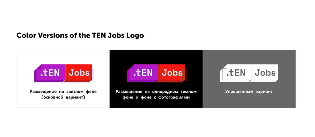
I developed TEN’s brand identity from the ground up, including the logo, color palette, and typography. The goal was to create a modern, professional look that resonates with the esports and gaming industry while remaining versatile across digital and promotional materials.
Platform Architecture & Prototypes
I crafted the site map and interactive prototypes, establishing a clear structure for the platform. This included mapping user flows and designing wireframes to ensure intuitive navigation and a seamless experience.
Design System Development
To support scalability and consistency, I built and maintained a comprehensive design system. This included reusable UI components, layout grids, interaction patterns, and guidelines.
👾
🎮
💻
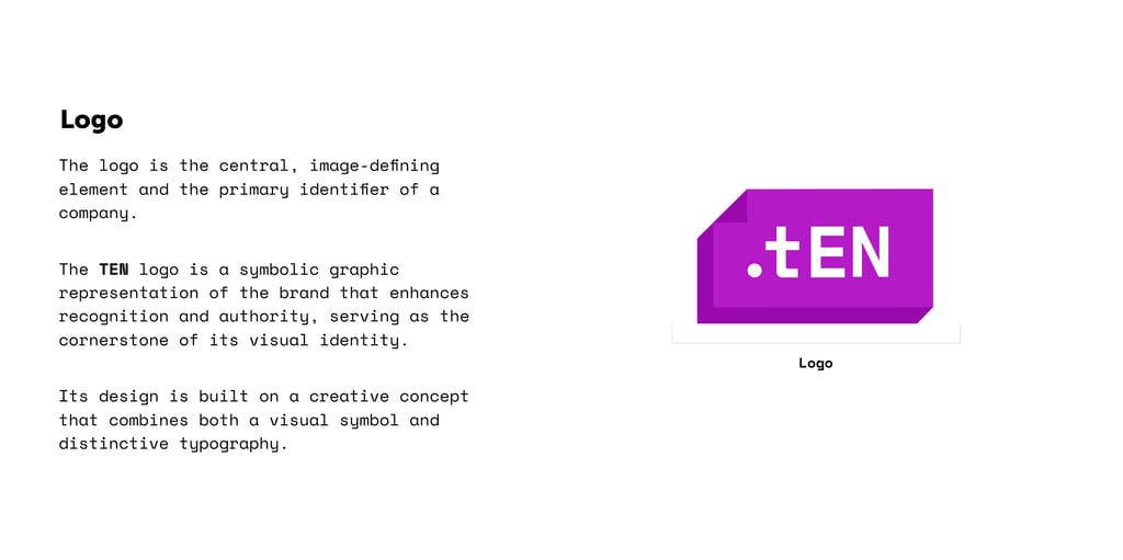
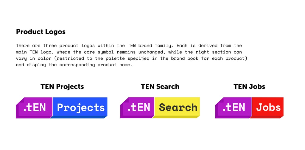
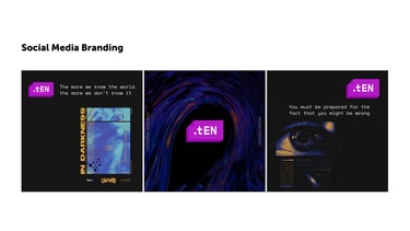
Creating Brand
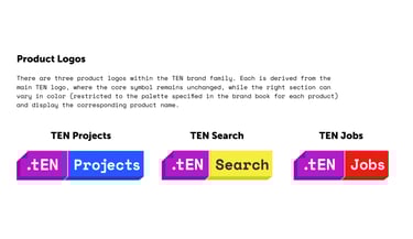
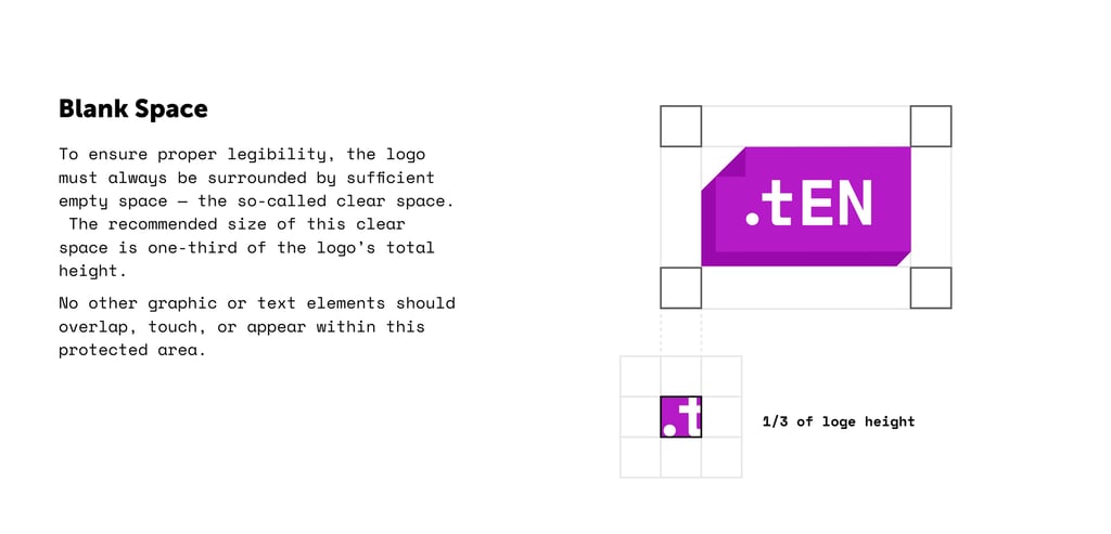
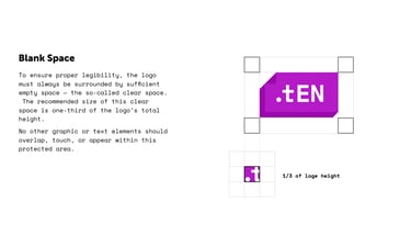
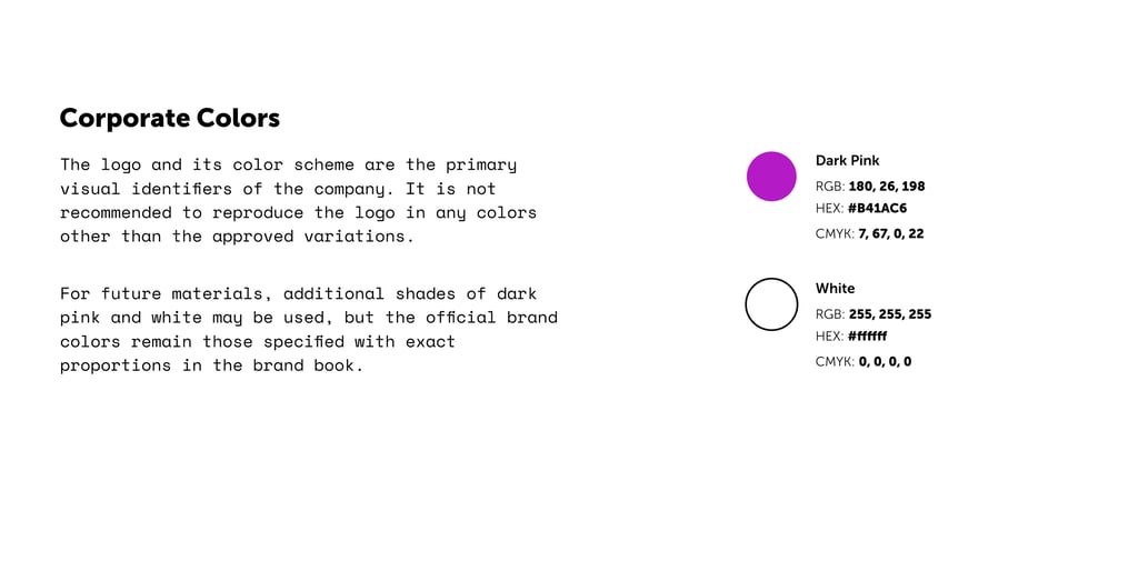
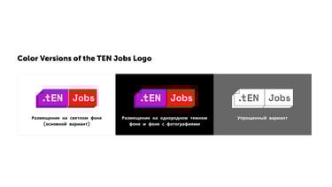
The foundation of this project began with creating a complete brand identity from scratch. I developed the logo, typography, and color system to establish a strong and recognizable visual language for TEN.
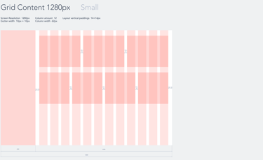
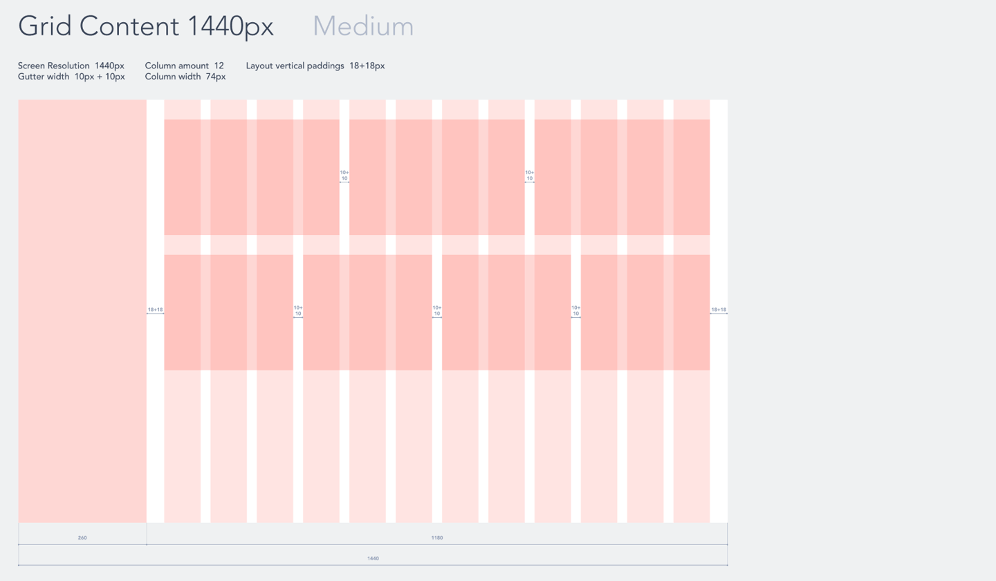
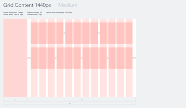
Responsive Layout
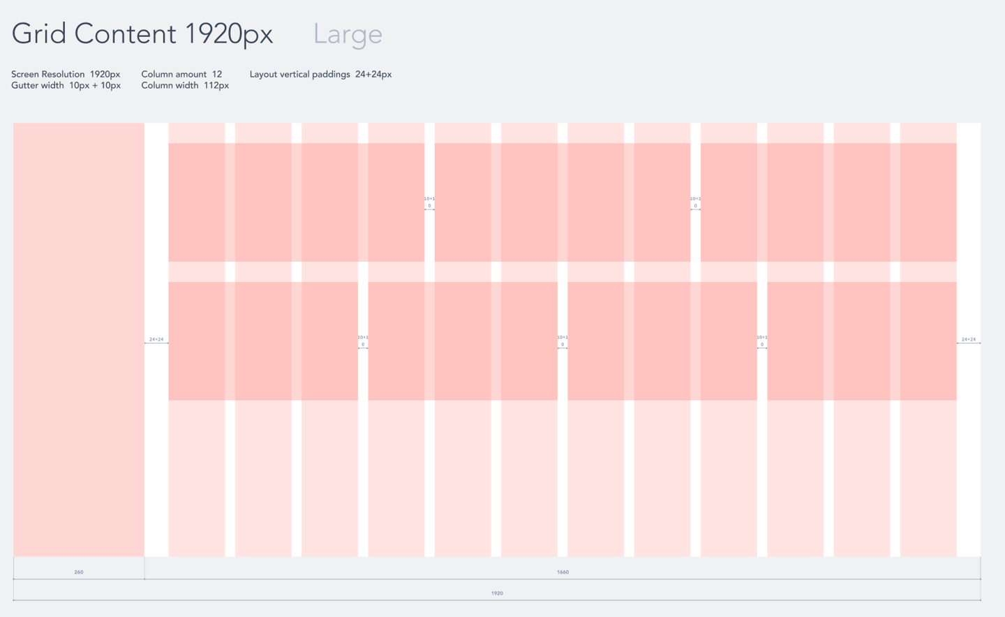
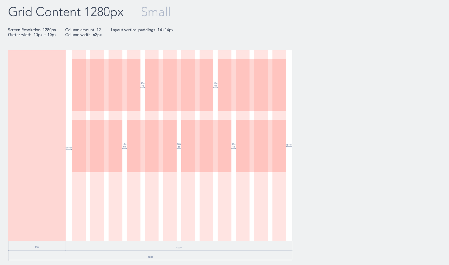
In this section, I explored different grid options and screen sizes to ensure consistent and flexible content placement across the platform. Most pages are built from modular blocks that follow a specific structure, so it was crucial to design adaptable layouts that maintain visual hierarchy. The three options shown demonstrate how content can be organized effectively while staying aligned with the overall design system.
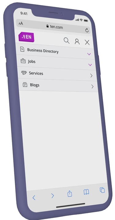
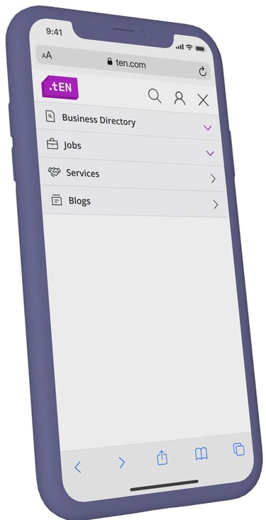
Navigation
The TEN project involved multiple key stakeholders, and the overall concept of the platform was quite complex. To align everyone on the structure, I organized a mini-workshop discussion with stakeholders to gather insights and define priorities.
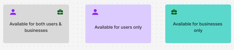
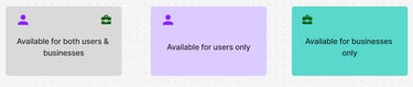
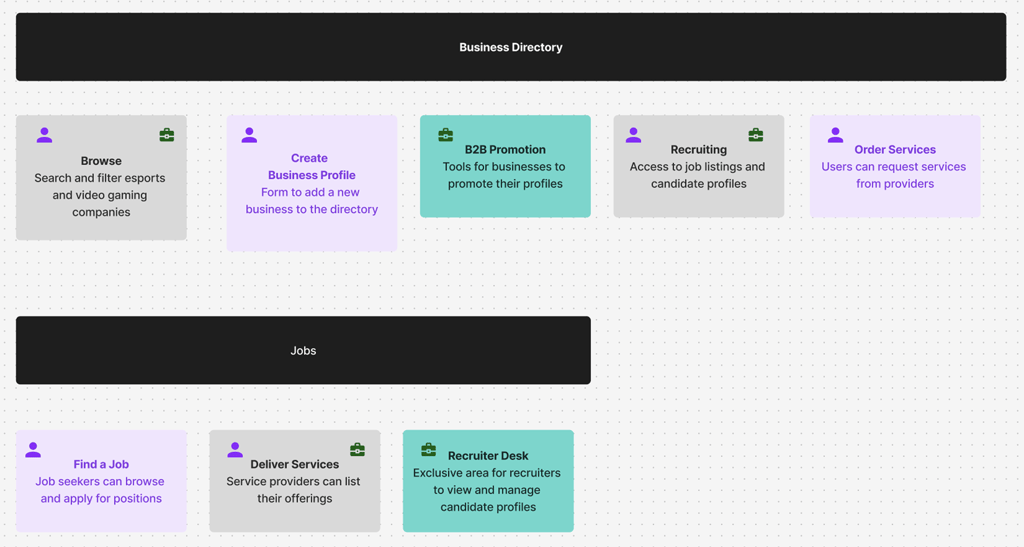
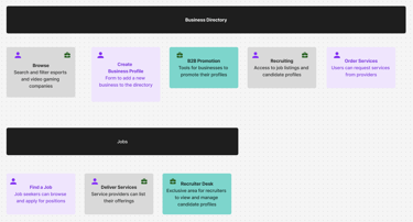
Using a color-coded legend and intuitive icons, I mapped out the platform’s navigation, resulting in two main service branches that clearly organize the user journey. The branches are illustrated below to show how functionality are structured across the platform.
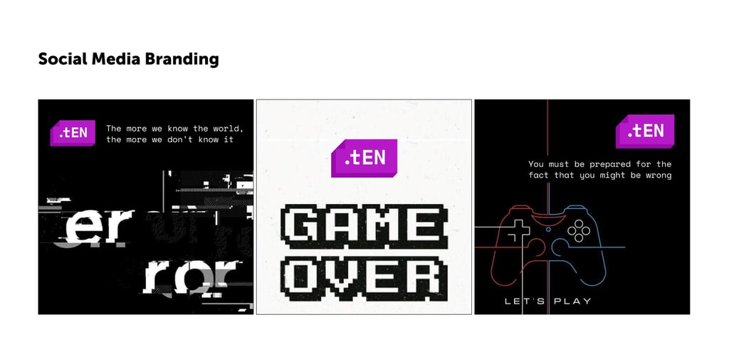
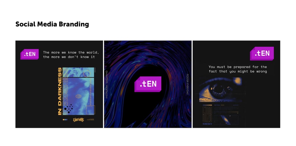
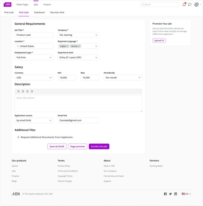
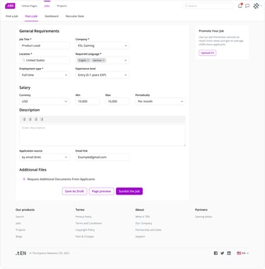
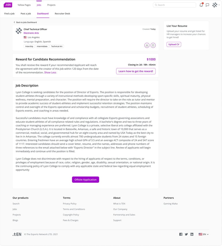
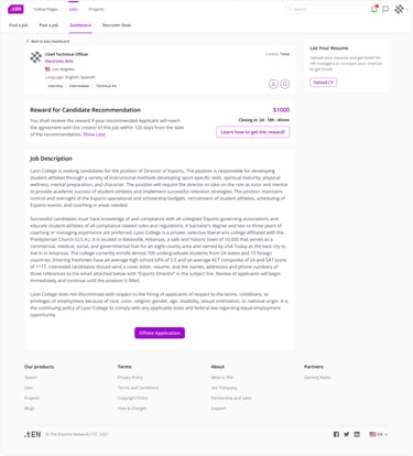
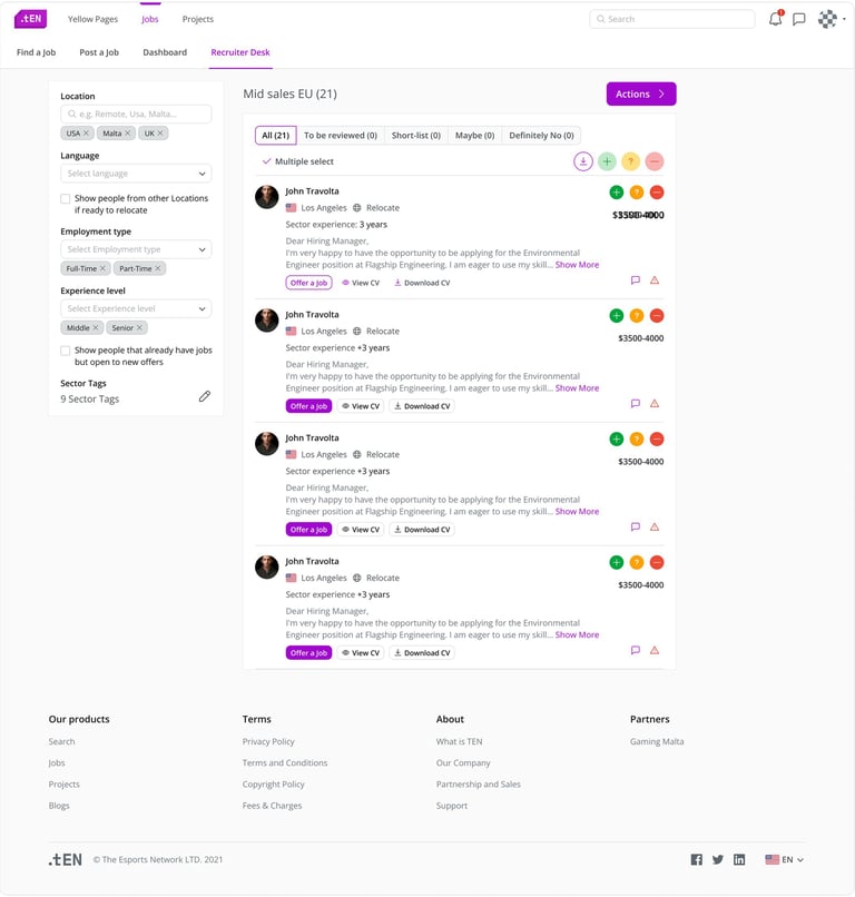
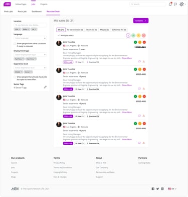
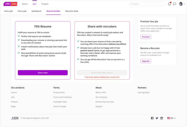
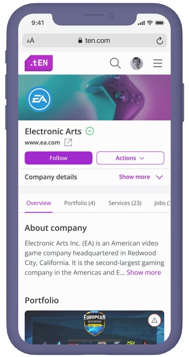
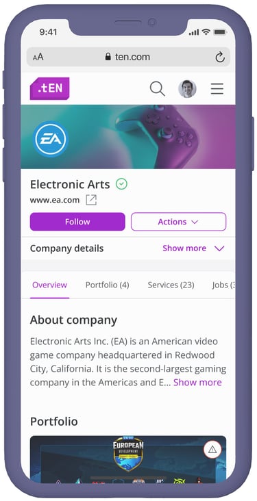
Designs
The platform includes a wide range of screens—below are just a few selected examples.
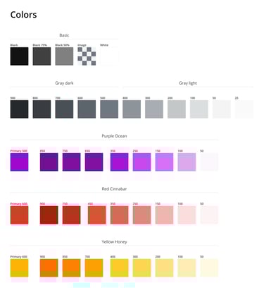
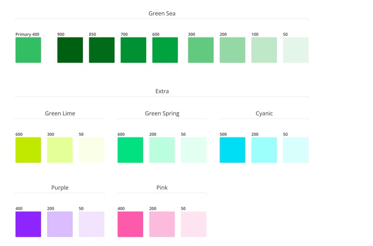
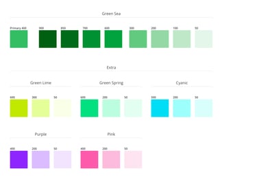
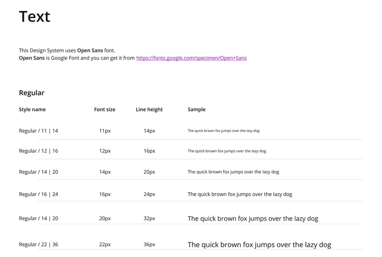
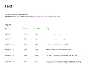
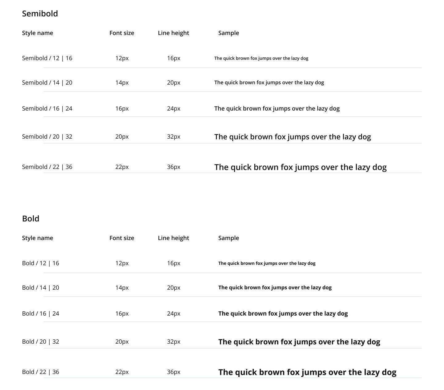
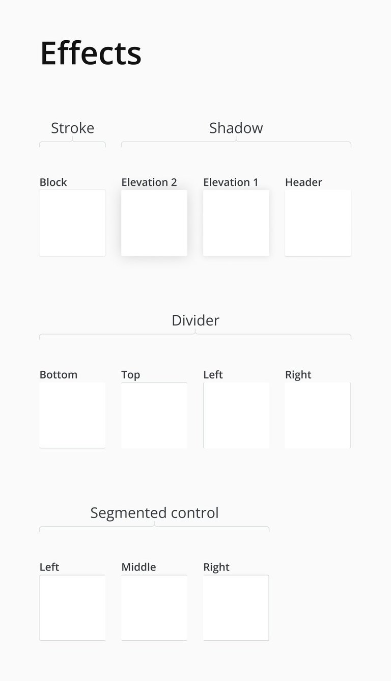
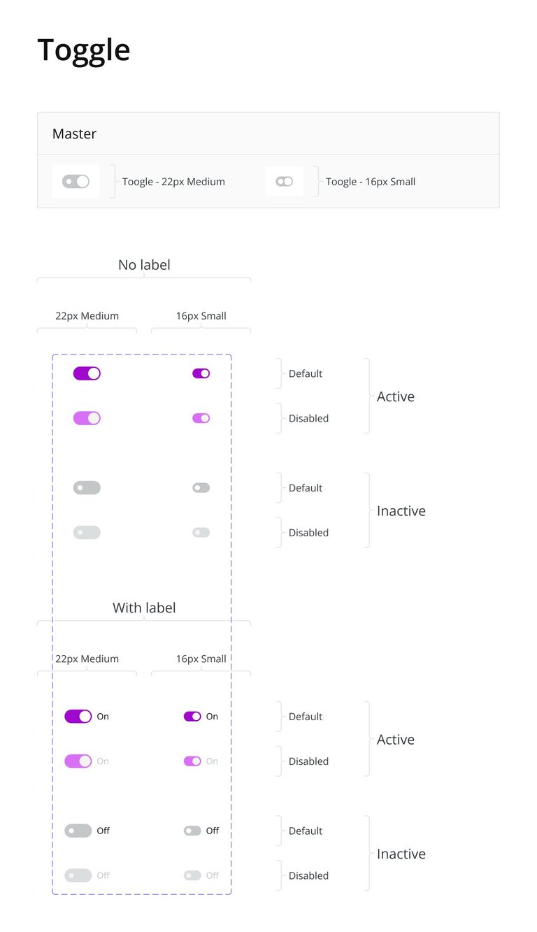
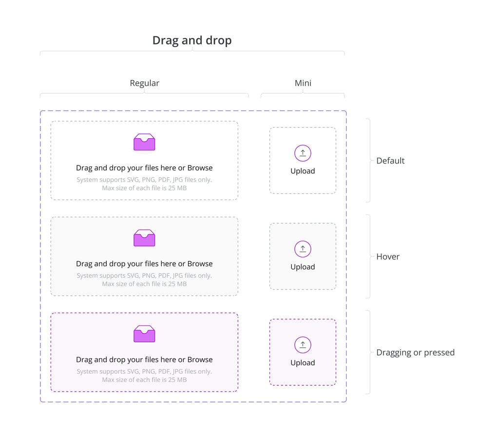
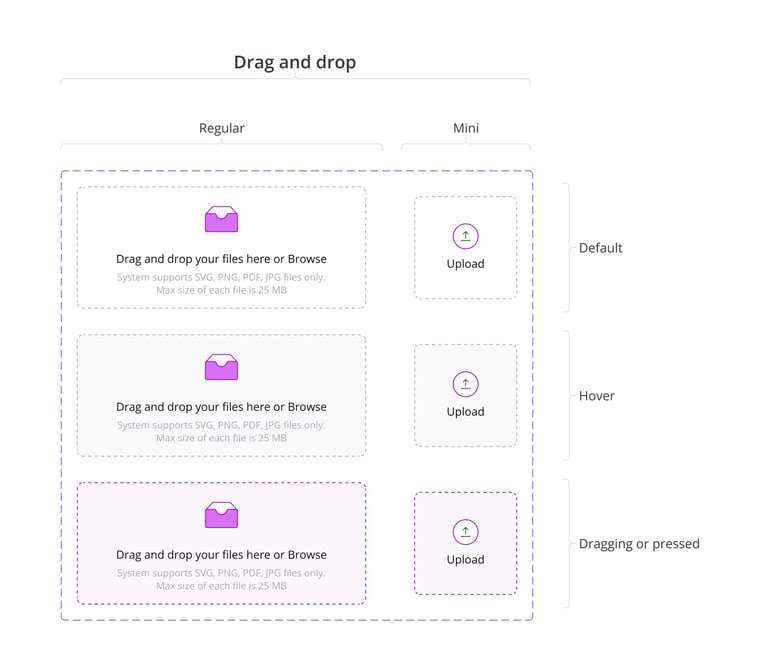
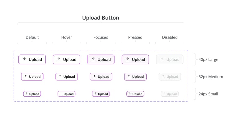
Design System
To ensure consistency and efficiency across the platform, I developed a robust design system that standardizes components, colors, typography, and interaction patterns. This system allows the team to work faster, maintain visual coherence, and scale the product smoothly as new features are added. By documenting reusable elements and best practices, the design system serves as a single source of truth for both designers and developers.


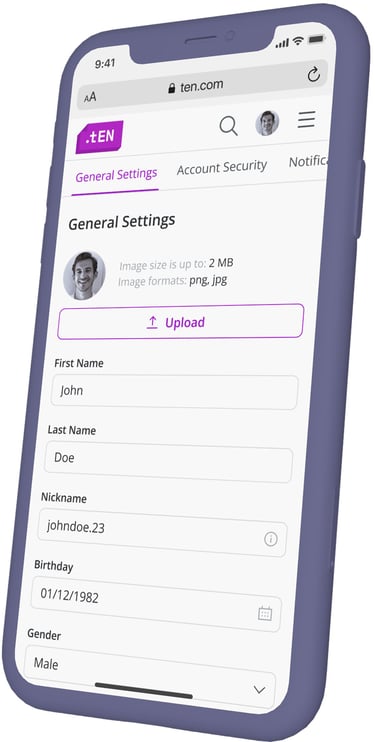
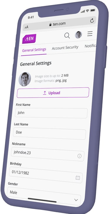
Responsive Design
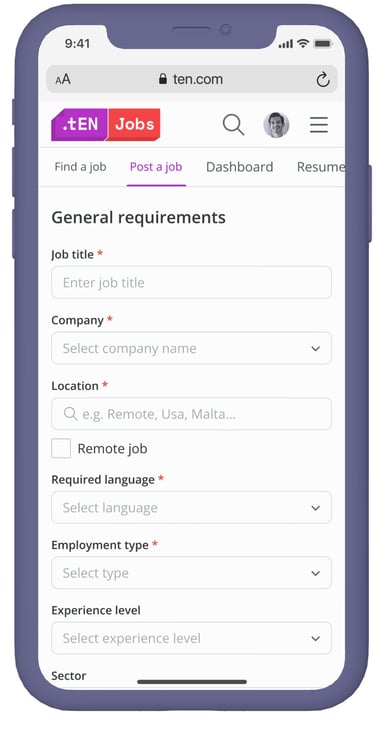
To meet the needs of users accessing TEN on the go, I designed mobile adaptations of key pages, ensuring that layouts, content blocks, and interactive elements remain clear and intuitive on smaller screens. The goal was to maintain consistency with the desktop experience while optimizing usability, readability, and touch interactions for mobile users.

Conclusions & Reflextion
What Was Done
In this project, I created the branding from scratch, including the logo, color palette, and typography. I also established the core platform structure, designing navigation and aligning stakeholders through interviews and workshops.
In addition, I built and maintained the design system, providing a strong foundation for consistency across the platform.
✅
⏳
What Could Be Improved with More Time
As this is a large-scale, continuously evolving platform, the design work is never truly “finished.” The design system is expanding as new features are introduced, and further refinements in UI and interaction patterns are constantly needed.
With more time, I would focus on iterative testing, scaling the design system further, and optimizing new functionalities to keep pace with the platform’s growth and user needs.