SAPI
Food Marketplace · Startup · Mobile App · 2022–2023
What I did
Research & User Insights
To understand whether and how this marketplace could actually work, I ran surveys and one-on-one interviews with potential sellers and buyers, and spent a day observing a food truck owner's real working routine to see where friction showed up in practice, not just in theory. That research fed empathy maps and four user personas, giving the team a shared, evidence-based picture of who we were designing for instead of relying on assumption.
Visual Language & Design System
I built Sapi's visual identity and UI kit from scratch — color system, typography, and a custom illustration style developed through several rounds of client feedback — giving the product a warm, community-first feel distinct from a typical marketplace app. Treating this as a system rather than one-off screens meant new features could be designed consistently as the product grew beyond its first release.
Prototyping, Testing & Dev Handoff
I translated research findings into a clickable Figma prototype and ran usability testing sessions to validate direction before development began, documenting findings in usability reports that shaped revisions ahead of build. I worked closely with the startup owner and dev team throughout — running story-mapping sessions to define what belonged in the first release versus later phases — and delivered development-ready screens grounded in what testing had actually validated, rather than untested assumptions.
Sapi is a community marketplace connecting home cooks and local food sellers with neighbors looking to buy homemade meals — an idea validated only by the founder's conviction, not yet by real user evidence. Before a single screen could be designed, the product needed proof: who would actually sell food this way, who would trust buying from a stranger's kitchen, and what it would take for either side to commit.
I joined at the earliest stage, working directly with the startup owner, Head of Marketing, and Head of Dev team to take Sapi from an unvalidated concept to a research-backed, development-ready product for its first release.
Surveys and Interviews
The survey went out to SAPi's own Facebook community, and two findings mattered most for where the product went next. First, people consistently preferred locally-cooked food over convenience — which meant SAPi's positioning couldn't just be "get food faster," it had to signal "this is from a real local spot," or the value proposition would misfire. Second, 70% of respondents said they relied on recommendations from family and friends rather than reviews or ads — a much stronger signal than I'd expected, and one that suggested a phone-contacts-based recommendation layer would land better than a generic star-rating system. The survey also validated the assumptions I'd gone in with (recommendations, ratings, communication, filtering) rather than overturning them, which told me the risk wasn't in the feature list — it was in getting the trust and locality signals right within it.
Survey Results
Interview Insights
I ran four 1-1 interviews with food truck and small food-business owners rather than a large sample, because at this stage I needed depth on daily workflow, not statistical breadth. Every owner — regardless of how long they'd been running their business or what they sold — was managing orders across multiple disconnected channels at once: live orders, WhatsApp, Viber, Instagram DMs, third-party delivery apps. That fragmentation, not any single feature gap, was the real problem: owners weren't asking for more channels, they were asking for one. The harder challenge was that their motivations for wanting a single system diverged — one owner cited COVID-driven pressure to reduce physical contact, another cited the sheer difficulty of costing out ingredients and cutlery per order, another wanted a business-owner community as much as an ordering tool. Reconciling those different "whys" into one prioritized order-management flow, rather than building a feature for each owner's specific complaint, was the key decision this research forced.
Observation Report
What I discovered
I ran four 1-1 interviews with food truck and small food-business owners rather than a large sample, because at this stage I needed depth on daily workflow, not statistical breadth. Every owner — regardless of how long they'd been running their business or what they sold — was managing orders across multiple disconnected channels at once: live orders, WhatsApp, Viber, Instagram DMs, third-party delivery apps. That fragmentation, not any single feature gap, was the real problem: owners weren't asking for more channels, they were asking for one. The harder challenge was that their motivations for wanting a single system diverged — one owner cited COVID-driven pressure to reduce physical contact, another cited the sheer difficulty of costing out ingredients and cutlery per order, another wanted a business-owner community as much as an ordering tool. Reconciling those different "whys" into one prioritized order-management flow, rather than building a feature for each owner's specific complaint, was the key decision this research forced.
Challenges
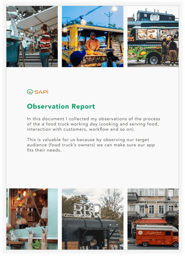
The harder finding was that the cost of fragmentation wasn't constant — it scaled badly with volume. With one or two open orders, Peter managed fine. Once he had six orders in flight, I watched him hand a customer the wrong package, because nothing distinguished one order from another beyond his own memory. That told me the fix couldn't just be "consolidate the inbox" — it needed order identity (numbers, labels) built in from the start, or the same failure would just move to a single-channel version of the same tool. That's a detail I wouldn't have gotten from interviews alone; owners rationalize their own workflow as manageable until you watch it break.
Empathy map
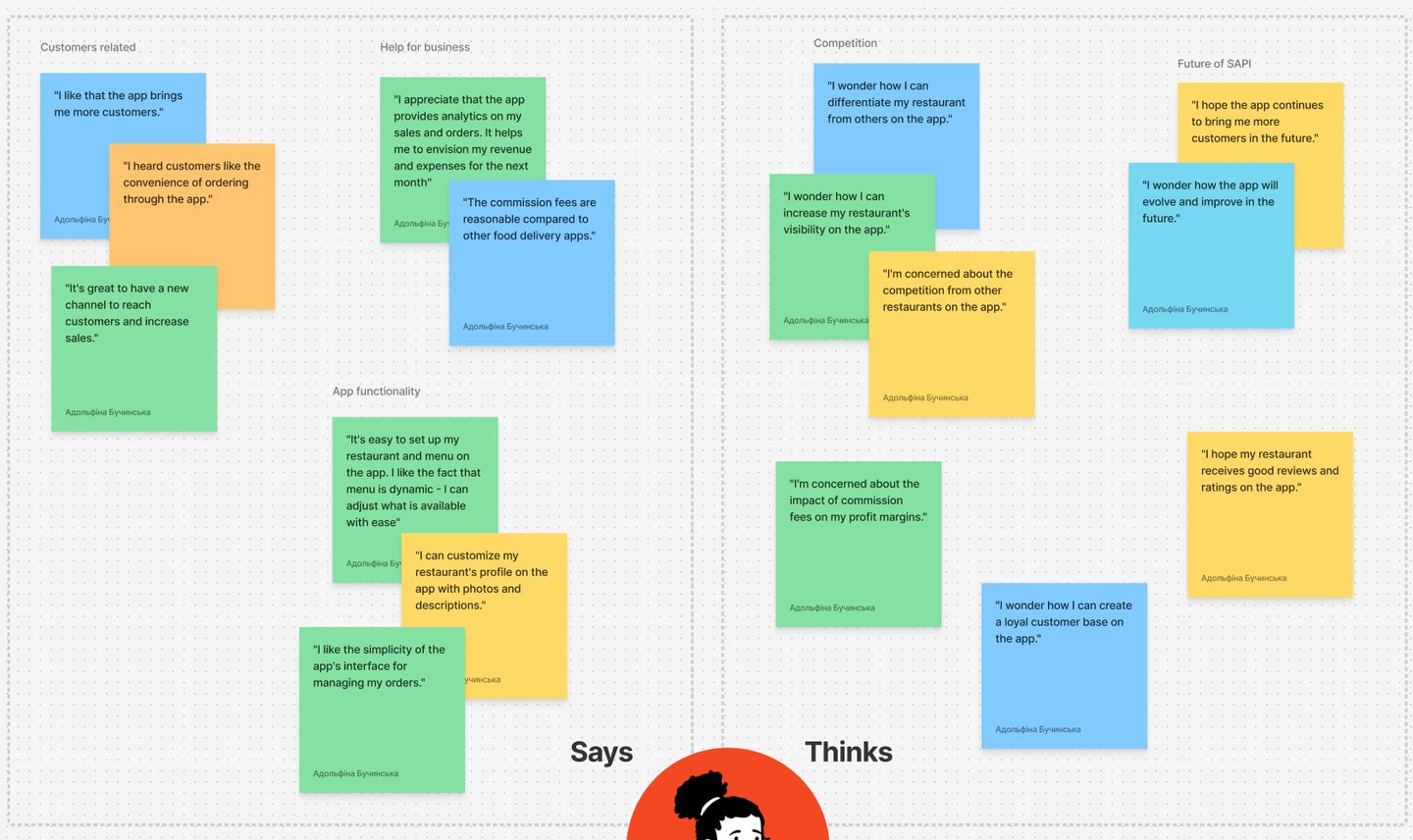
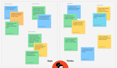
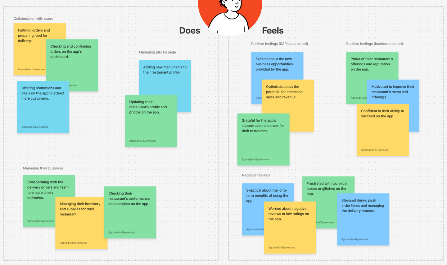
Composing seller feedback into a full says/thinks/does/feels view showed a split that was easy to miss in raw interview notes: day-to-day, sellers were doing exactly what the app supported well — updating menus and photos, checking dashboards, coordinating delivery — and felt genuinely optimistic about growth and new business. But underneath that, the emotional layer told a different story: skepticism about long-term reliability, frustration with technical glitches, and real stress during peak order volume, on top of the commission and competition concerns from before.
That mattered because it reframed the risk for the client — the challenge wasn't proving sellers wanted the app, they clearly did, it was proving the app would hold up operationally under pressure and stay worth the fee over time, which is a retention problem, not an onboarding one.


The buyer map surfaced a different tension than the seller side entirely: buyers wanted discovery and choice — trying new local restaurants, browsing for deals, exploring dishes outside their usual order — but that same openness came with real decision friction, shown in quotes like not knowing what to order or needing reassurance a restaurant fit dietary needs. The Feels quadrant confirmed this wasn't minor: buyers were anxious about food quality on a first order, stressed about picking the "right" restaurant, and confused by menu or app features, even while feeling genuinely excited about trying something new when it worked.
That mattered because it reframed the buyer-side problem for the client — it wasn't a demand problem, buyers clearly wanted to explore, it was a trust and decision-support problem, meaning features like reviews, recommendations, and clear ordering flow weren't nice-to-haves, they were what stood between a buyer's curiosity and them actually completing an order.
Together, the two maps pointed to the same underlying need from opposite sides of the transaction: sellers were worried about proving reliability and value over the long term, while buyers were worried about trusting that reliability upfront, before they'd ever placed an order. Solving for one side without the other wouldn't be enough — the app needed to give buyers early trust signals (reviews, clear info, recommendations) precisely so that sellers' operational effort would actually convert into the loyal customer base and steady orders they were hoping for.


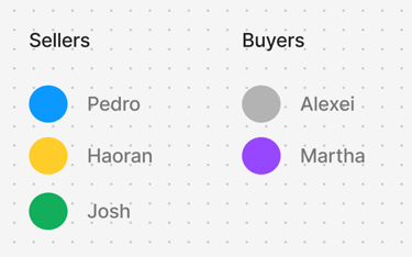
Rather than treating "seller" as a single persona, the research pointed to three genuinely different seller profiles with different risk tolerances and needs: Jerry, an established food truck owner focused on scaling without adding operational overhead; Stefanie, an amateur home cook testing the waters of a side business, uncertain of legal boundaries and unable to commit much time; and Frans, a struggling restaurant owner who wanted an ordering app but was explicitly worried about cost and reliability given tightening margins. Nicole, the customer persona, wanted to discover and support local food but was blocked less by lack of desire and more by not knowing where to look or what to expect once she got there.
User Personas
What I discovered
Why this mattered
Collapsing these three seller types into one persona would have hidden a real prioritization problem: a feature that delighted Jerry (who's already tech-comfortable and actively trying to scale) could easily overwhelm or intimidate Stefanie, and a paid feature that made sense for Jerry could be a dealbreaker for Frans, who was already priced out of delivery platforms like UberEats. Keeping them separate forced an explicit question for every design decision going forward: which seller segment is this actually for, and does it hurt the others? That's a materially different design constraint than solving for "sellers" as one undifferentiated group.
Business Canvas model
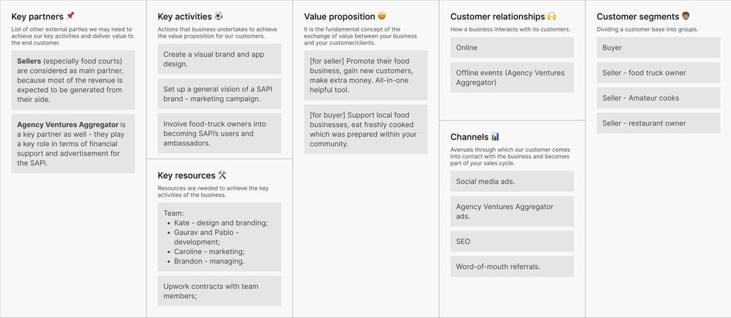
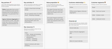
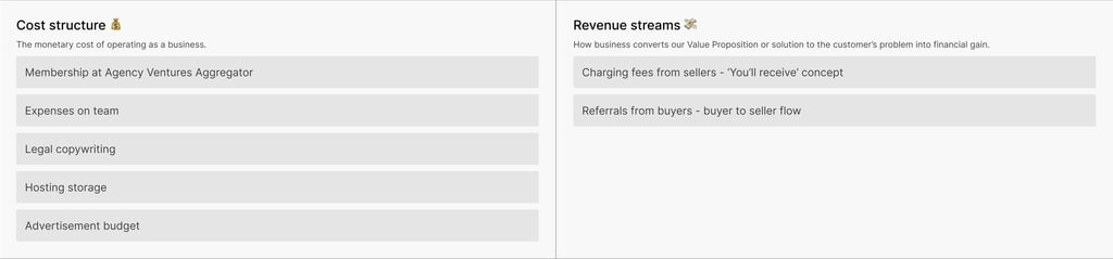
Before moving into the design sprint, I suggested we pause and map the business model together, since interviews had surfaced multiple seller types and a buyer type, but no one had yet defined how value or money would actually flow between them. Working through the canvas live with the startup owner clarified two things that hadn't been explicit before: sellers were the primary revenue source through a "you'll receive" fee model, while buyers functioned as the growth engine through seller referrals — meaning the two sides needed to be designed for differently even though they'd share one product. It also positioned the Agency Ventures Aggregator as more than a marketing channel — a key partner for both distribution and financial backing. Doing this exercise before design work started meant every feature decision that followed could be checked against an agreed business logic, rather than the business model getting reverse-engineered from whatever got designed first.
User story mapping
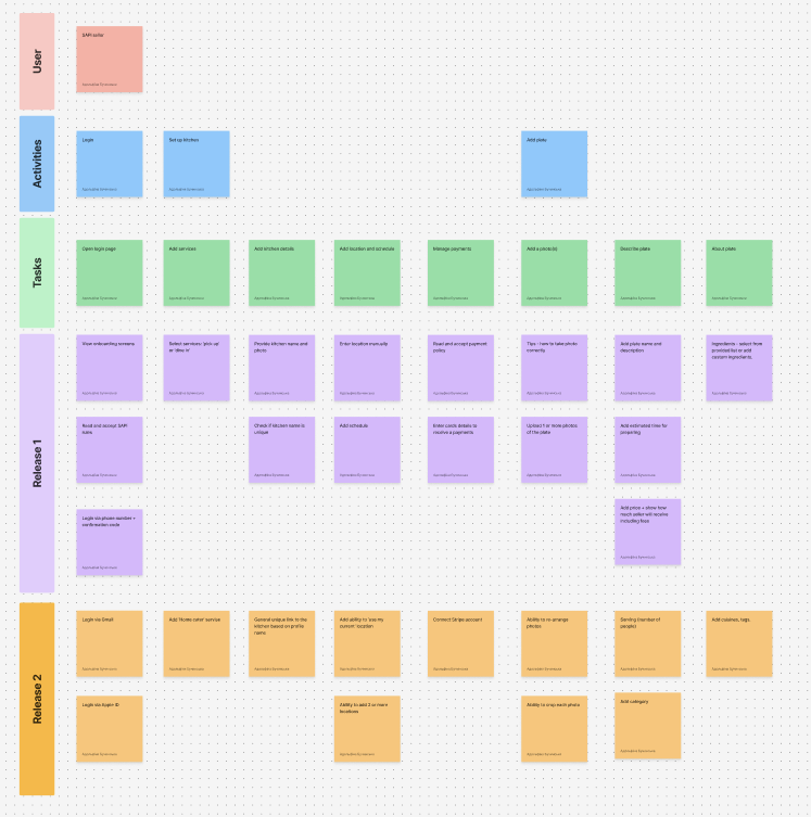
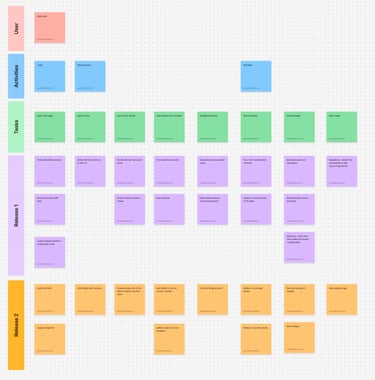
Once the business model was aligned, I ran a user story mapping session with the startup owner and Head of Dev to translate that plan into an actual build sequence. We deliberately scoped this exercise to the seller's journey only, since a seller needs to be able to set up a kitchen and list a plate before any buyer-facing functionality has value — buyer stories were left out of scope for this pass. Breaking the seller journey into user goals, activities, and tasks made it possible to draw a hard line between what a seller needs to go live at all (onboarding, kitchen setup, listing a plate, connecting payment) versus what could wait (additional login methods, multi-location support, richer photo management, a catering variant).
Having that line visible to both the founder and the dev lead meant Release 1 stayed genuinely minimal, instead of quietly expanding as new ideas came up mid-build.
Team and Collaboration
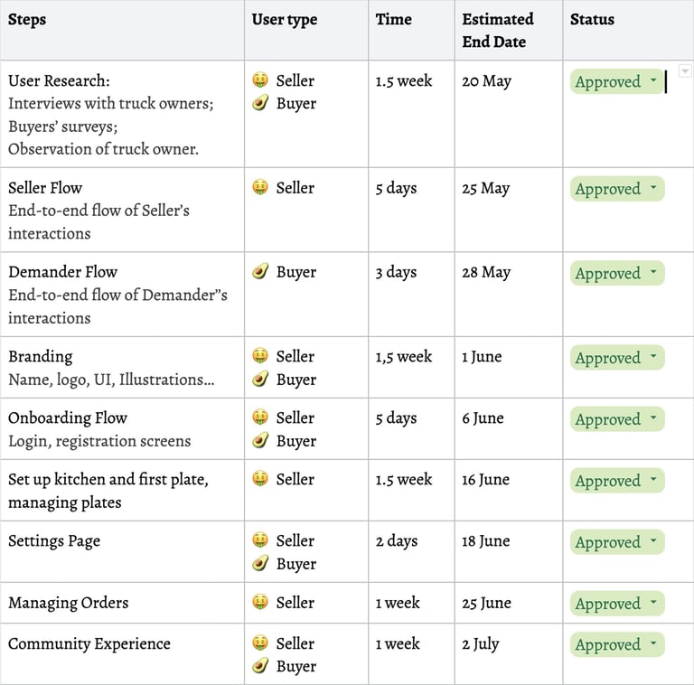
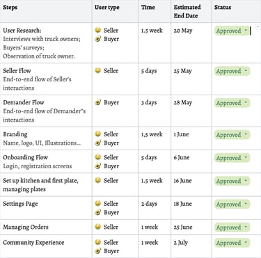
Throughout the project I coordinated a small cross-functional team — the Startup Owner, Head of Marketing, and Head of Dev — and took ownership of keeping our work sequenced and user-centric rather than technically-driven. I set up the step-by-step timeline myself, estimating durations and end dates for each phase and tracking status as we moved through them, so the team always had a shared, current view of what was approved, in progress, or blocked.
This structure was my own initiative, not something the client asked for — I introduced it because without an explicit sequence and owner sign-off at each step, it would have been easy for research, branding, and build work to start overlapping in ways that created rework later.
Colour schema and illustrations


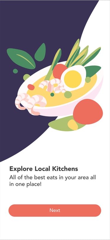
I started by sketching rough concepts for the onboarding illustrations, then developed three distinct visual styles for the client to react to. The client selected the first option, which set the direction for color palette and character style across the rest of the product. As I built out the remaining illustrations, client feedback led to some adjustments along the way — including changing character skin tone to better reflect the diversity of the target community. The four onboarding illustrations below were the result, later extended into additional supporting illustrations used throughout the app.
Option 1 ✅
Option 2
Option 3


Screens


SAPI was handed off to the development team with a validated release plan rather than launch metrics — at this stage, the useful signal wasn't user data but stakeholder alignment. Every seller-facing feature in Release 1 had been agreed on by the startup owner and Head of Dev through the story mapping session, the business model had been mapped and approved before design work began, and the design system was built on tokens rather than hardcoded values so the dev team could implement consistently without me in the room for every decision. The clearest evidence the process worked: nothing in the approved scope needed to be renegotiated once build started.
Outcome
What Was Done
This project combined early-stage discovery with product and business strategy work — surveys, interviews, and direct observation of food truck owners, translated into empathy maps and personas that distinguished between meaningfully different seller types rather than treating "seller" as one persona. Beyond the research, I facilitated two structured sessions with the startup owner: a Business Canvas exercise to align on revenue and value flow before any design work started, and a user story mapping session to scope Release 1 down to what a seller actually needed to go live. I also introduced a step-by-step tracking table to keep the cross-functional team — marketing, dev, and the founder — moving at the same pace.
What Could Be Improved
Because SAPI hasn't launched to real users yet, every prioritization decision in this project was based on interviews, observation, and judgment rather than usage data. With more time, I'd want to validate the Release 1 scope against actual seller behavior post-launch — confirming, for instance, that the single-order-channel problem observed with Peter holds across a broader group, and that the fee-anxiety signal from the empathy map shows up as a real drop-off point rather than just a stated concern. I'd also want usability testing on the actual build, not just the prototype, before treating any of these decisions as fully proven.