
OnMap
Real Estate Marketplace · Israel · Web + iOS/Android · 2023–2025
What I did
Branding Refresh
OnMap's visual identity hadn't kept pace with larger, better-funded competitors in the Israeli listings market — a real liability in a category where trust signals directly affect whether someone shares contact details or views a property. I refreshed the logo, typography, and color system to feel more current and credible, while preserving enough continuity that returning users still recognized the brand.
UX & UI Design
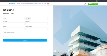
OnMap runs in Hebrew (right-to-left), English, Russian, and French, across web and native iOS/Android apps — meaning every flow had to hold up in both writing directions and under very different content lengths. I rebuilt the core structure from prototypes through high-fidelity UI, focused on keeping search, filtering, and listing details consistent regardless of language or device.
Developer Collaboration
OnMap's edge against larger incumbents is its map-based search — users draw a custom boundary and see only the listings inside it. I worked directly with engineering to validate what was feasible before finalizing the interaction, then helped establish design system guidelines so the pattern could scale consistently as the product grew.
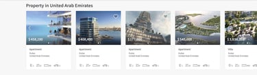
OnMap is one of Israel's real estate marketplaces, competing for buyers, renters, sellers, and agents against larger, more established platforms. When I joined, that competitive gap was showing up in the numbers — sessions averaged around 28 seconds, support was fielding a steady stream of tickets about search confusion and bugs, and agents had little reason to prioritize listing on OnMap when the platform didn't yet look or feel as credible as its competitors.
The brand hadn't kept pace either, which mattered more than it might elsewhere — in a category where trust signals directly affect whether someone shares contact details or lists a property, looking unfinished was a real liability, not just a cosmetic one. The brief was to modernize both the brand and the product enough to compete for higher-intent users, without alienating OnMap's existing base, across four languages and both web and native apps — without a costly full rebuild.
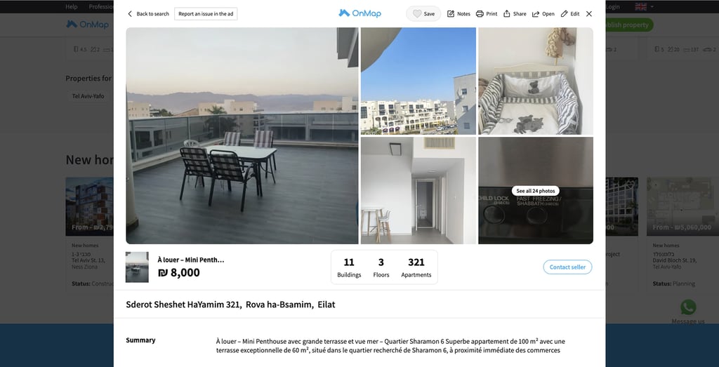
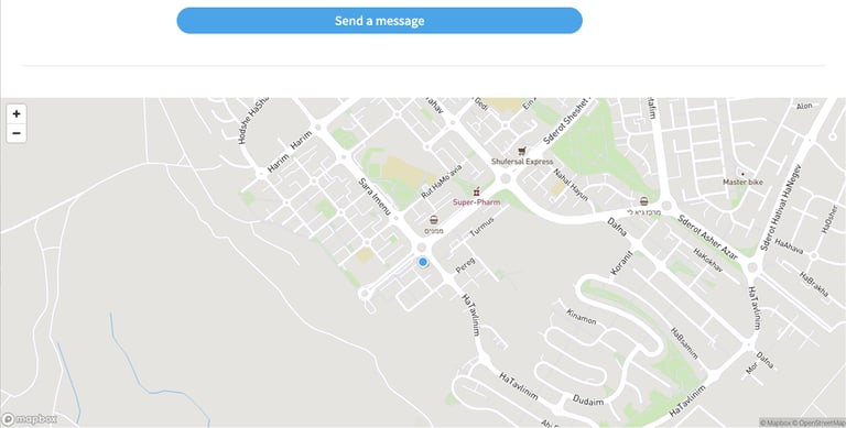
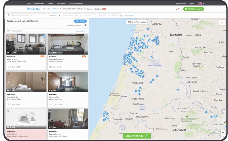
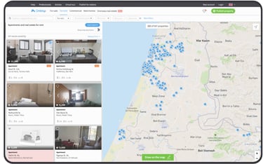
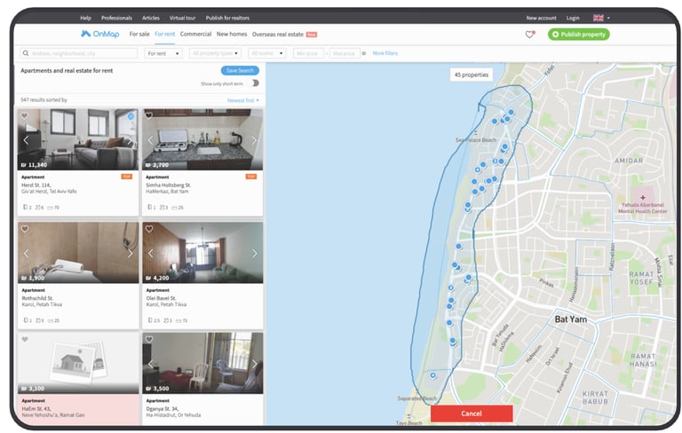
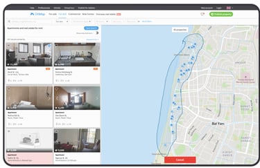
The existing product separated the map and property cards into two distinct panels — map on one side, listings on the other — and the client wanted to keep that separation, with a property only appearing once a user clicked its pin on the map. The tension was that this pattern buried the platform's core differentiator: map-based search is OnMap's strongest advantage over larger competitors, and hiding listings behind a click added friction to the exact interaction meant to set the product apart.
I proposed combining the two into a single connected view — map and listings visible together, without expanding the map to take over the full screen — so users could browse properties and see their location context simultaneously, with no extra step required to reveal either. This kept the map's spatial value front and center while still surfacing listings as a first-class part of the same screen, rather than treating them as separate modes.
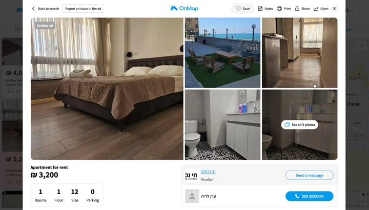
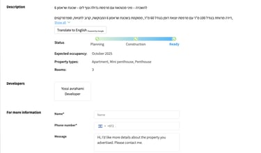
Information hierarchy on the property card
The client's initial direction was for the map to be the dominant, full-screen element, with users drawing a search area and individual properties only appearing after clicking a specific point — treating the map as the platform's standout feature. I pushed back on the premise that this needed to be a unique differentiator at all; map-based search with a drawable radius is a pattern most real estate platforms already use, so the goal wasn't to invent something new but to make an already-familiar interaction as convenient as possible.
I proposed a layout where property cards sit in a narrower column alongside a larger map, rather than behind it — users draw or adjust their search area, and the listings update automatically in the same view, with no click required to reveal a property. This kept the interaction aligned with what users already expect from map-based search elsewhere, while removing the extra step the client's original version would have required.
Map and listings layout

Supporting four languages meant more than translating text — Hebrew's right-to-left reading direction required the entire layout to mirror, not just the copy. In the English version, for example, property cards sat on the left with supporting content on the right; in Hebrew, that whole structure needed to flip so the layout read naturally in the opposite direction.
The difficulty was less about translation and more about making sure every component — cards, filters, navigation, map controls — had a defined mirrored state, so the product felt native in Hebrew rather than like an English layout awkwardly reversed. I addressed this by building RTL support into the design system itself rather than handling it case-by-case per screen, so each new component came with both directions defined from the start, keeping the experience consistent as the product expanded across languages.
Layout mirroring for Hebrew (RTL)
Brand Feel
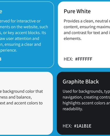
OnMap's brand needed to read as credible as Israel's largest real estate platforms, without losing the approachability that built its early user base.
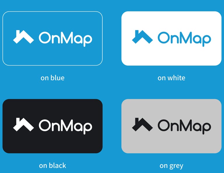
Logo
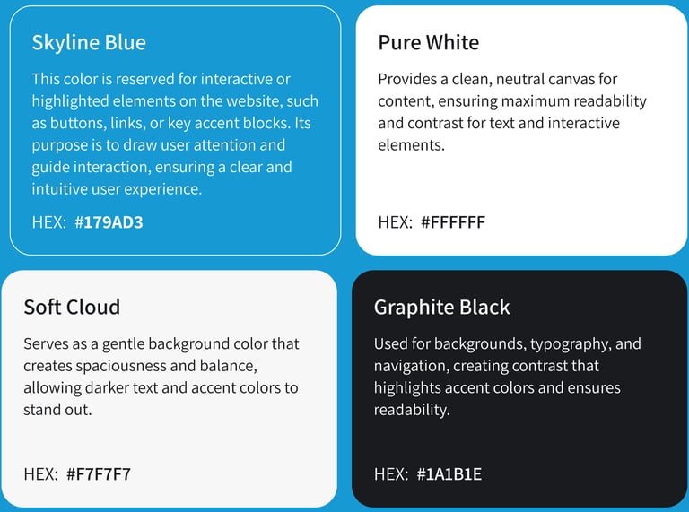
Colors
In a product people use daily to browse, compare, and contact sellers, color isn't decorative — it's how users tell primary actions from secondary information at a glance. The system stays deliberately small: one accent color earns all the attention, and three neutrals do the rest.
Simplifying the Header and Hero Section
To validate assumptions about the existing homepage, I ran a set of five short interviews with potential agents and users, focused specifically on first-screen impressions. Several findings came out consistently: the header's two-row structure — informational links like Help, Professionals, and Articles stacked above core navigation — was described as confusing, with participants unsure where to look first. The bright green CTA button was called out as overly dominant, with its white label difficult to read clearly against it.
Participants also flagged that the hero headline, "Discover a place you'll love to live," was hard to read against the background photo, a contrast issue that undercut the first impression the page was meant to create. On top of these findings, the four-option search switcher (Buy, Rent, New Homes, Commercial) asked users to commit to a category before they'd even begun browsing, adding friction to the platform's main entry point.
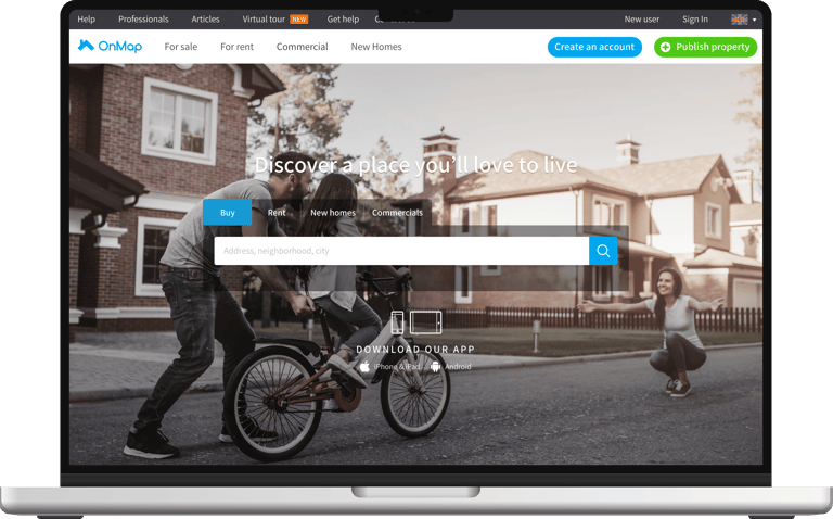
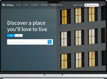
Older Version
Solution
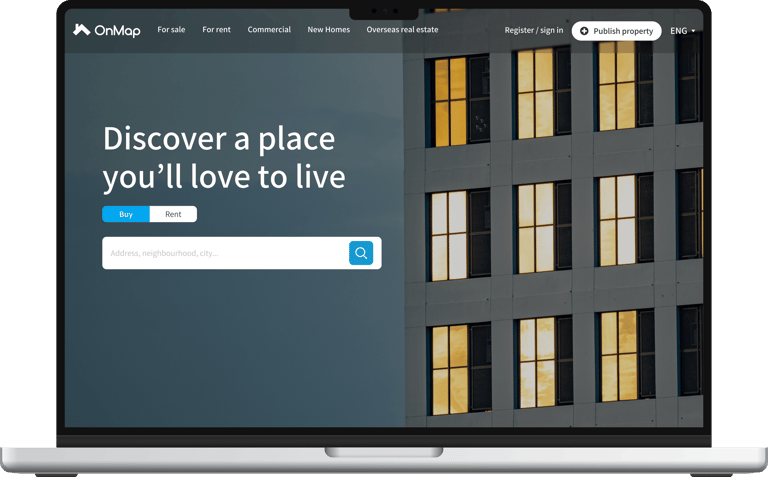
I collapsed the two navigation rows into a single header, moving lower-priority links like Help, Articles, and Contact Us into the footer, where they remained accessible without competing for attention at first glance. I replaced the hero background image specifically to restore contrast against the white headline text, so legibility no longer depended on which photo happened to be live.
Search was reduced to the two highest-intent actions, Buy and Rent, with New Homes and Commercial moved into on-page filters rather than removed — preserving the same options while cutting the upfront decision users faced before searching at all. I also rebalanced the header's call-to-action hierarchy: the previous version used a bright green button for account actions, which visually outweighed everything else on the page.
Since OnMap's priority audience for registration was agents rather than casual browsers, I redesigned "Publish Property" as a white button against the dark header — giving it visual weight — while keeping Register and Sign In deliberately quieter, since those served users who were just browsing rather than the agents the platform most needed to convert.
Before
After
After launch, average session duration grew from around 28 seconds to roughly 1 minute 43 seconds — a sign users were browsing rather than bouncing. The product manager also reported a drop in support tickets tied to navigation and search confusion, and agent activity grew alongside this, with more agents choosing to list on OnMap in addition to competing platforms — a meaningful trust signal in a market where agents are selective about where they invest listing effort. Traffic also rose over this period, though some of that likely reflects SEO and organic search gains rather than the redesign alone.
Outcome
UX/UI Design
I developed high-fidelity prototypes that guided the structure, layout, and interactions of the platform. Each screen was carefully designed to be intuitive, user-centered, and visually consistent with the refreshed branding
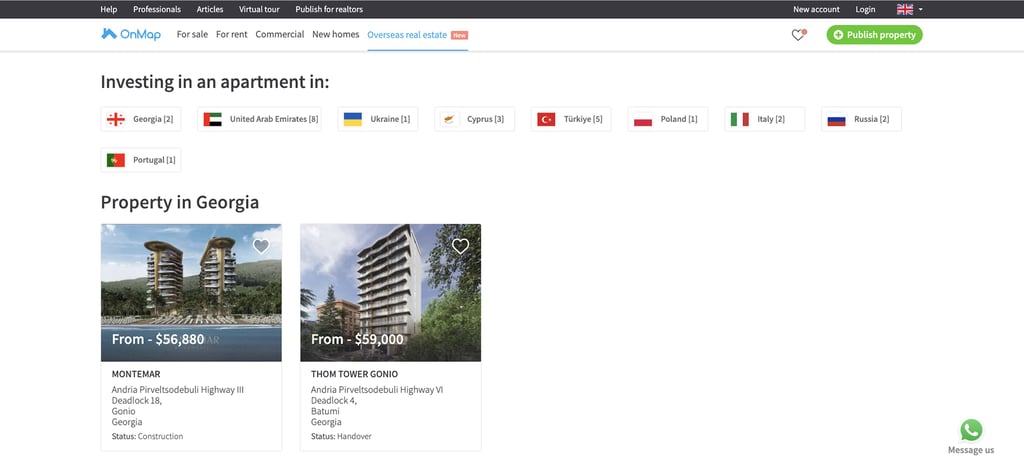
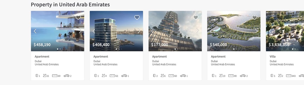


Map Functionality
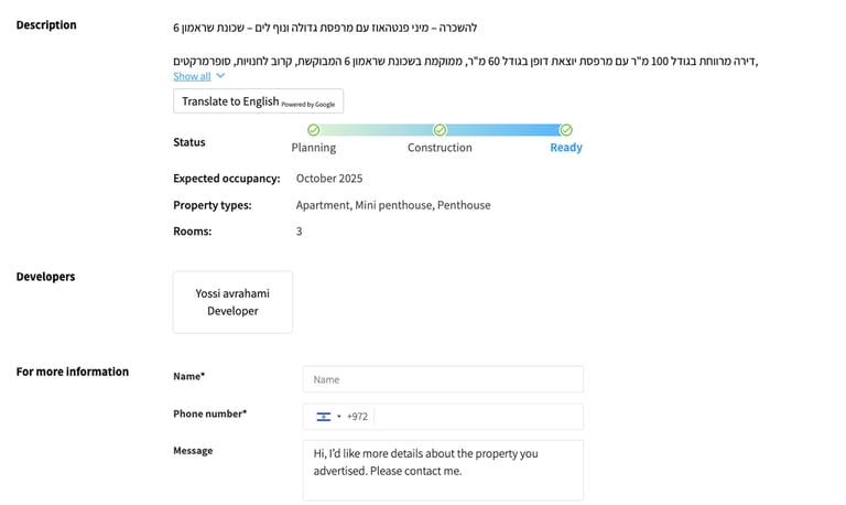
I collaborated closely with the development team to integrate an interactive map feature that allows users to explore properties visually. My role was to ensure a smooth and intuitive experience with the “Draw on the Map” functionality, enabling users to select specific areas and view only the properties within them. This feature is particularly useful for exploring neighborhoods, waterfront locations, or any custom-defined regions, making property searches more efficient and tailored to user needs.
→
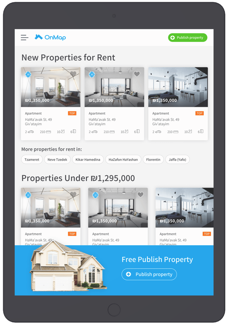
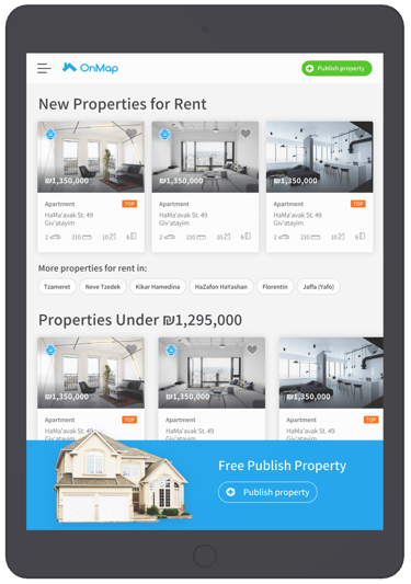
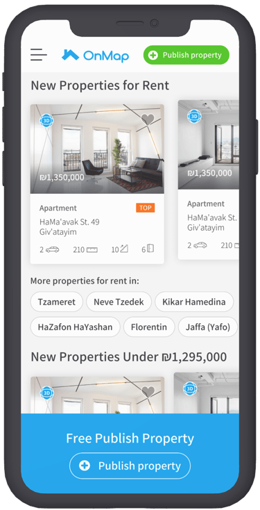
Mobile / Tablet Design
A significant portion of OnMap users access the platform via mobile phones and tablets, making it essential to adapt the design for these devices.
I created responsive layouts to ensure the interface scales properly across different screen sizes, maintaining usability, visual consistency, and a seamless experience whether users are on a desktop, tablet, or mobile device.

Conclusions & Reflextion
What Was Done
In this project, I combined my expertise in branding, UX, and UI design to refresh OnMap’s digital identity and enhance the overall user journey. I modernized the visual style, simplified navigation, created responsive layouts, and collaborated with developers to implement key features such as the interactive property map with drawing functionality.
Prototypes and interface refinements ensured clarity and consistency, while design system guidelines supported scalability. Together, these steps helped transform the platform into a more intuitive, modern, and user-focused experience.
✅
⏳
What Could Be Improved with More Time
With additional time, I would conduct more in-depth user testing and A/B experiments to validate design choices, such as color contrasts, typography, and navigation flows. I would also explore tablet-specific optimizations to further enhance mid-size screen usability and ensure seamless transitions between devices.
Gathering analytics on user behavior could provide valuable insights for continuous improvement—such as identifying drop-off points in the search journey or refining map interactions. These extra steps would elevate the platform’s usability and deliver even greater value to users.