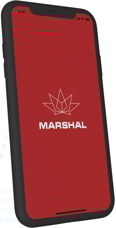
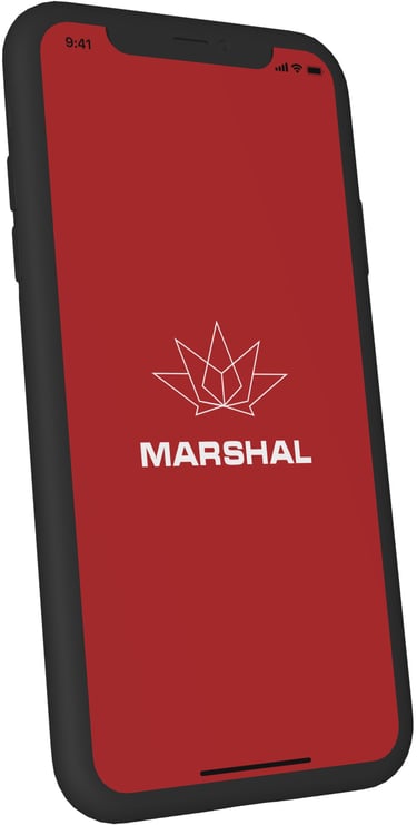
Marshal
Marshal Ukraine is a mobile app that combines essential fuel station services with loyalty and navigation features. Users can calculate fuel usage, find and map the nearest gas stations, access the latest promotions, and manage their loyalty program—all in one place. I helped steer this project’s UX and UI to make these complex functions feel seamless, usable, and engaging.
My role in this project
Photography
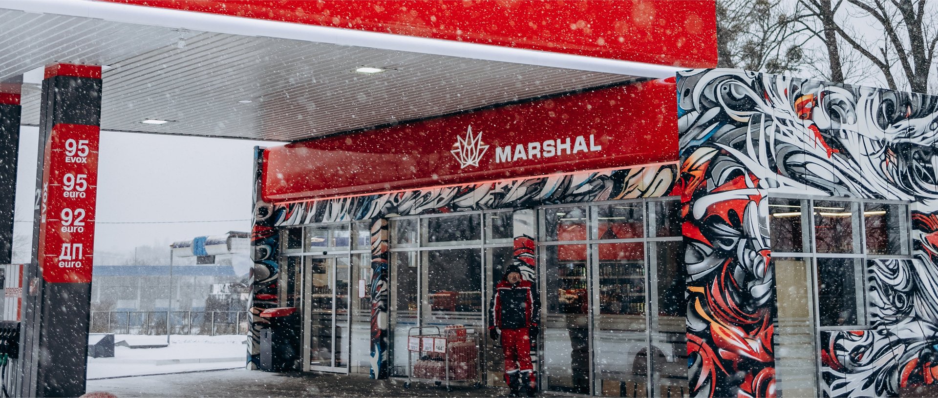
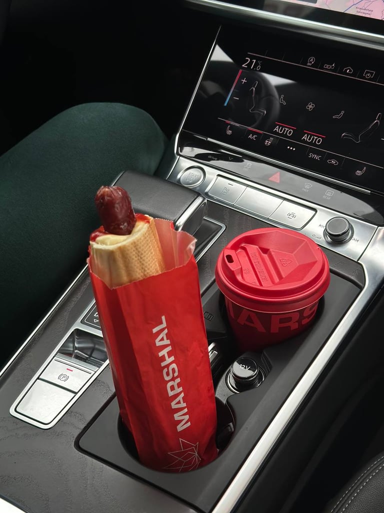
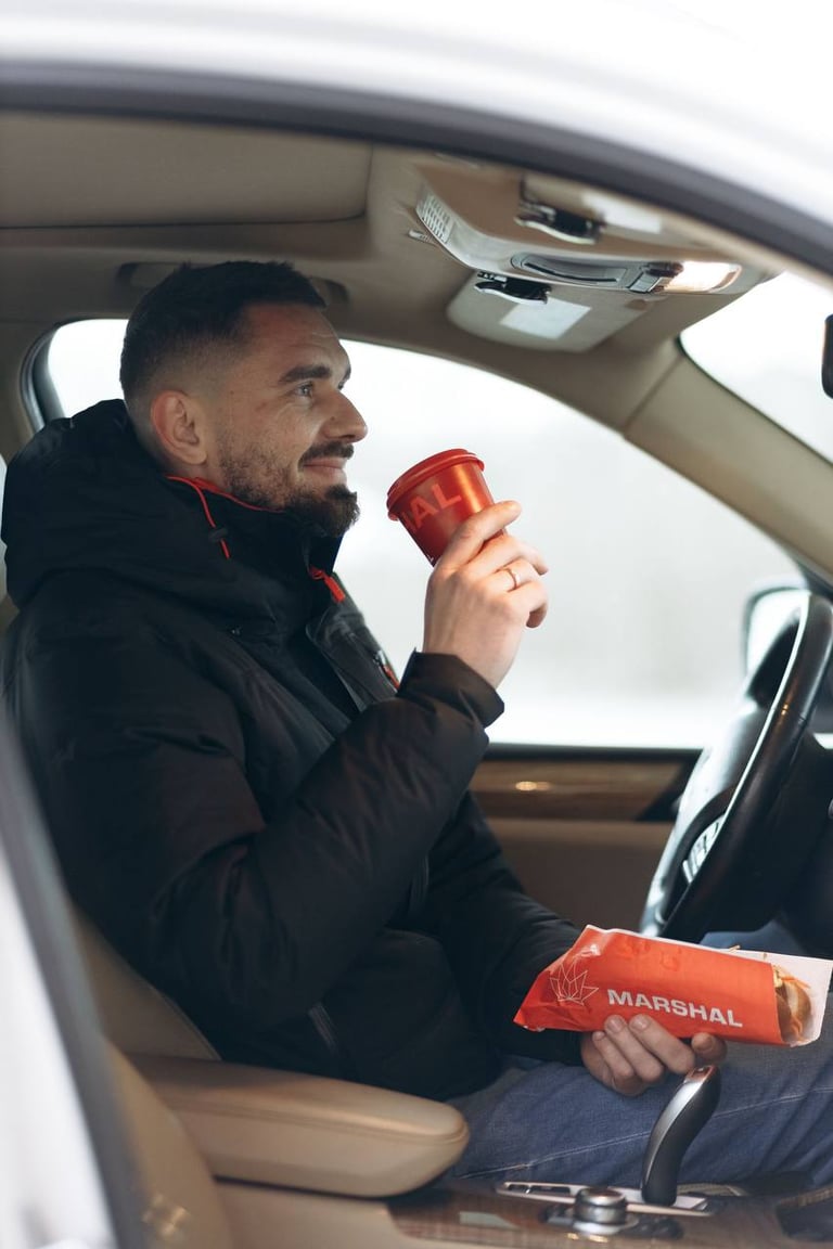
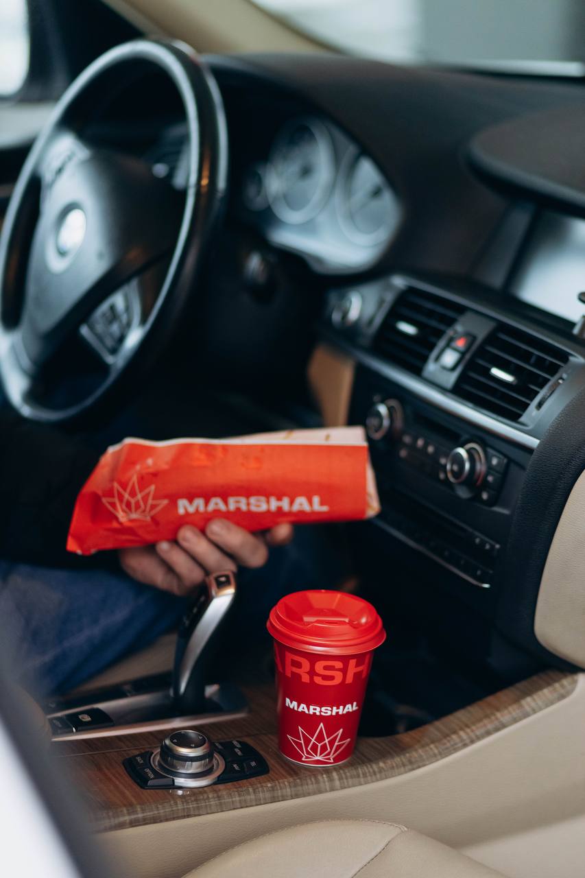
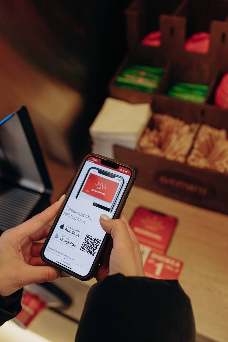
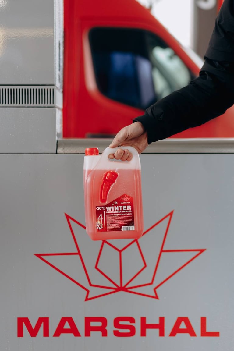
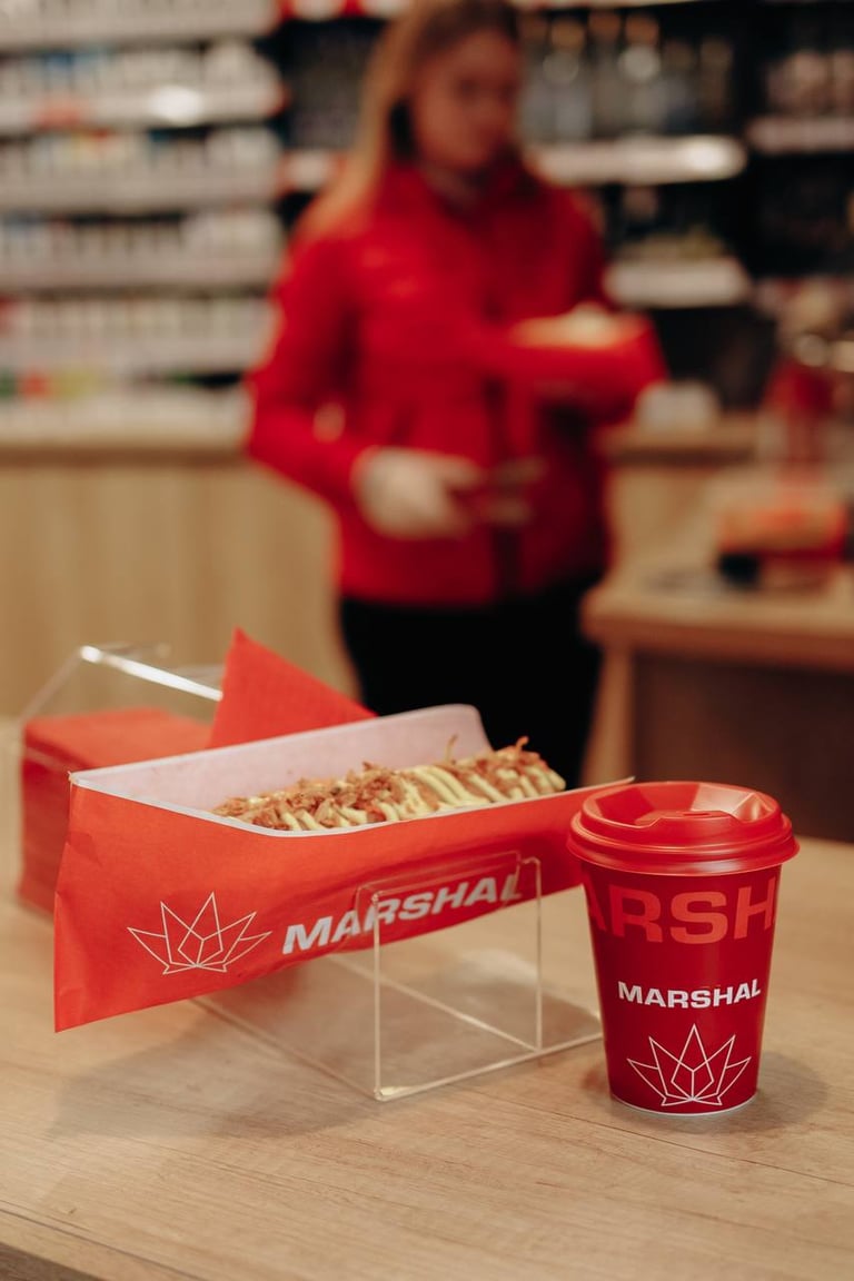
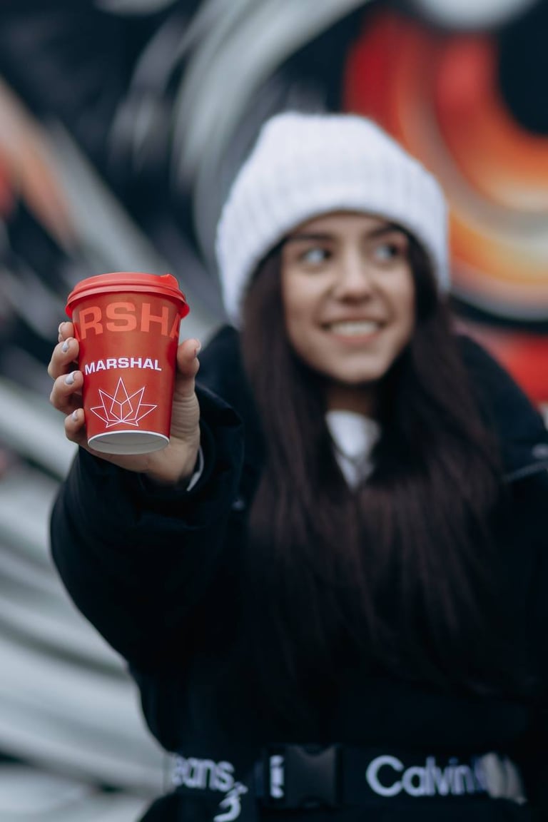
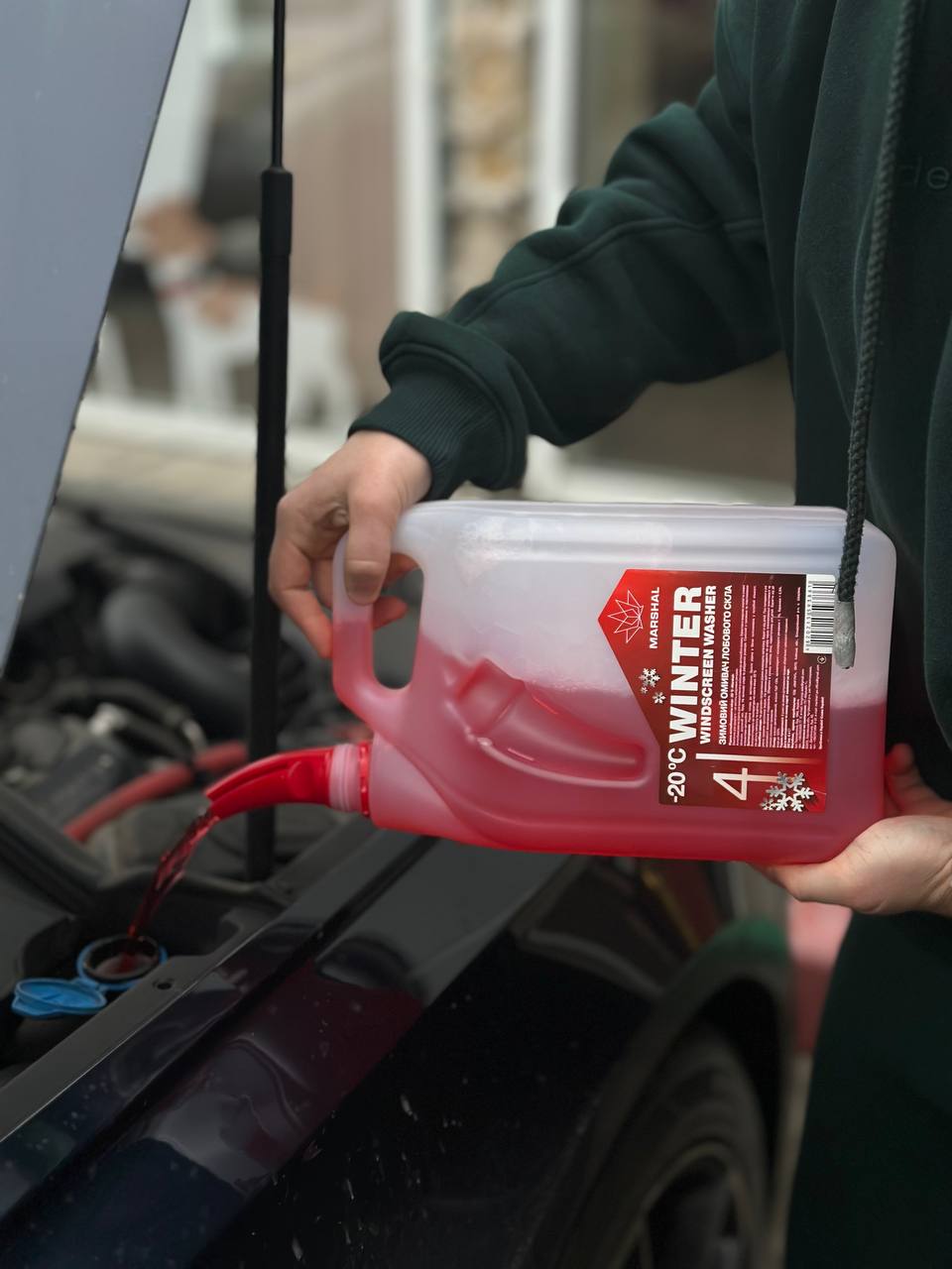
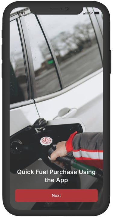
I conducted on-site photoshoots at Marshall gas stations, capturing both real locations and people to reflect the brand’s authentic, friendly atmosphere. These visuals were later used in the app onboarding screens to create an engaging and trustworthy first impression.
App Design & User Flow
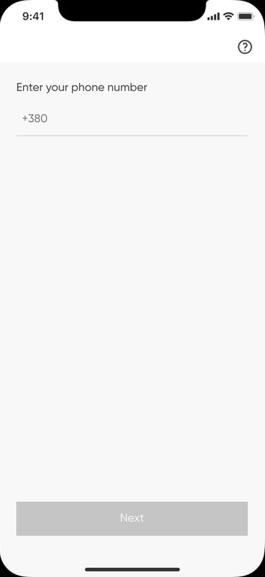
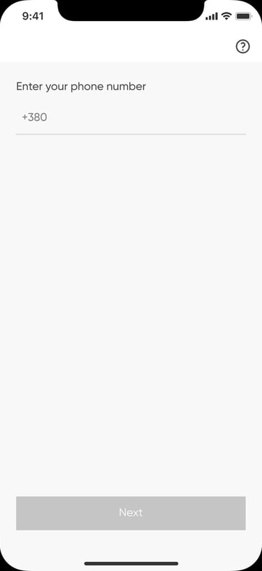
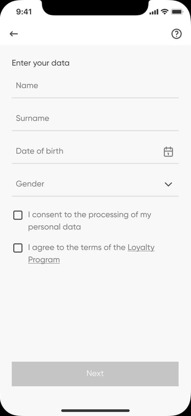
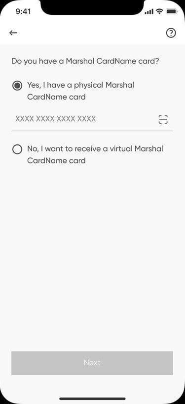
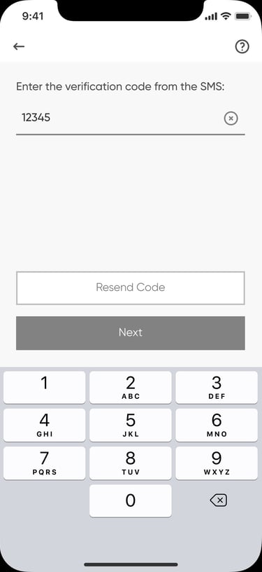
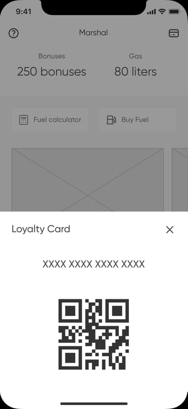
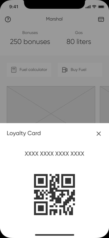
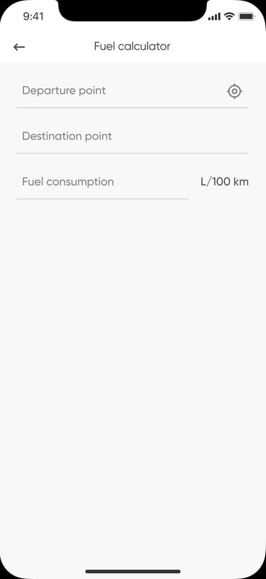
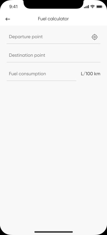
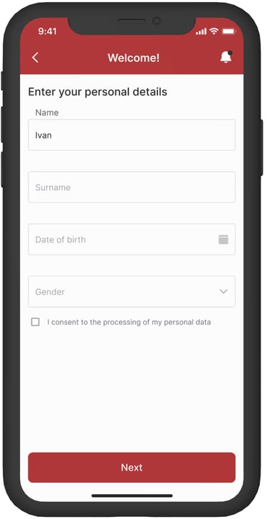
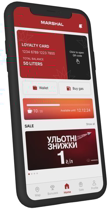
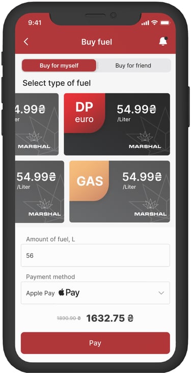
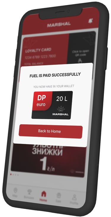
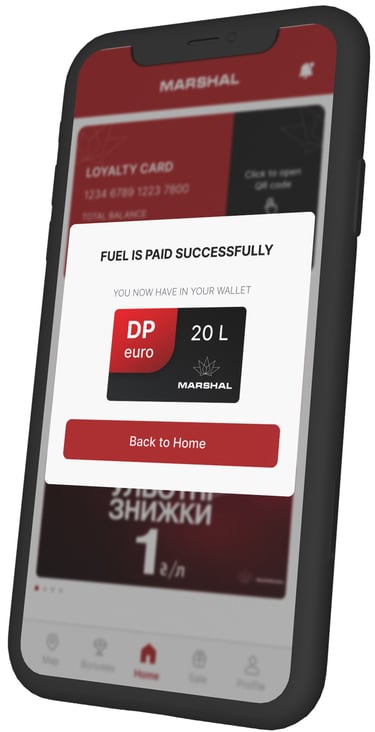
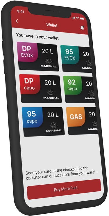
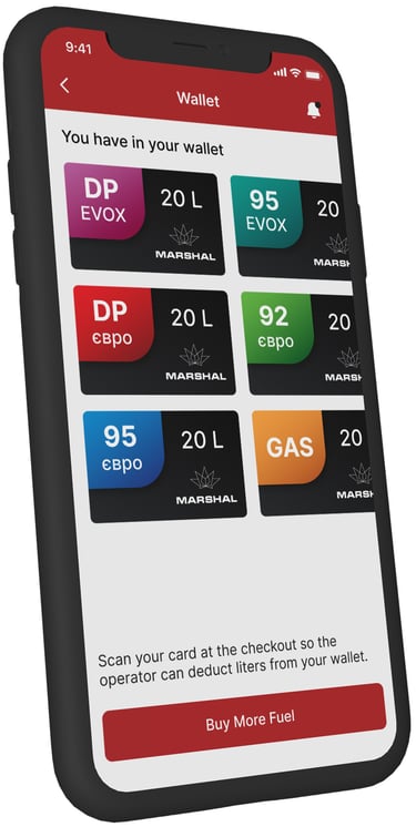
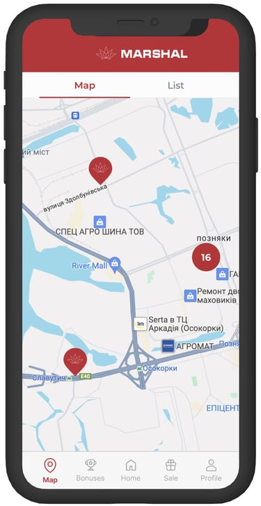
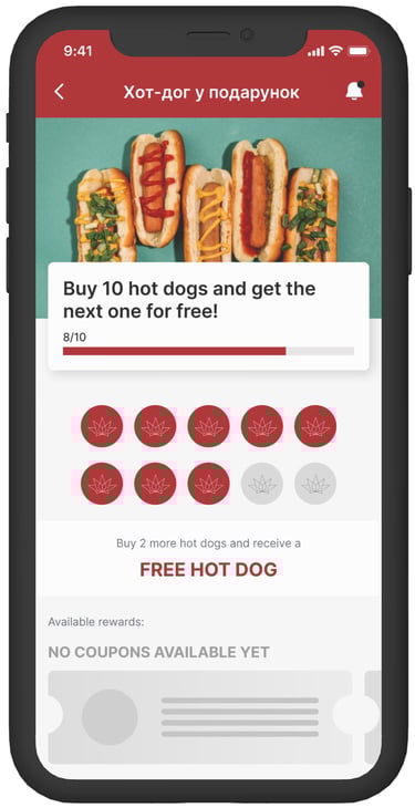
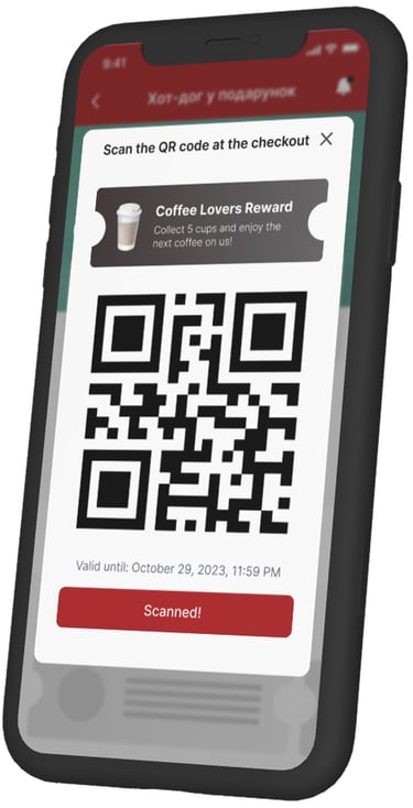
I designed the full user experience — from wireframes and interactive prototypes to the final UI. The app allows users to purchase fuel, collect and redeem bonuses, and access rewards like free coffee or snacks, making everyday refueling more enjoyable and rewarding.
Icons & Illustrations
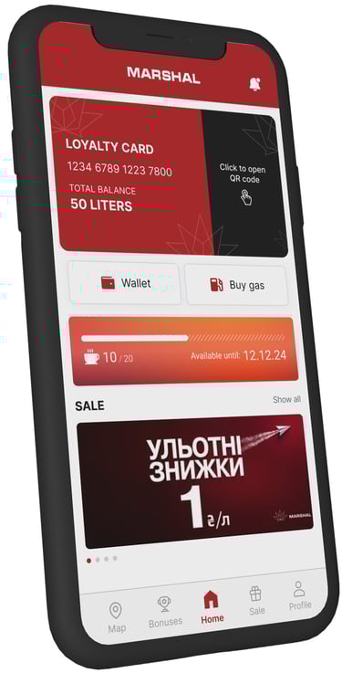
To add personality and clarity to the app, I created a set of custom icons to visualize user progress and achievements (e.g., earning free coffee or hot dogs), as well as themed illustrations for promotional banners and loyalty features.
📷
📱
⛽️
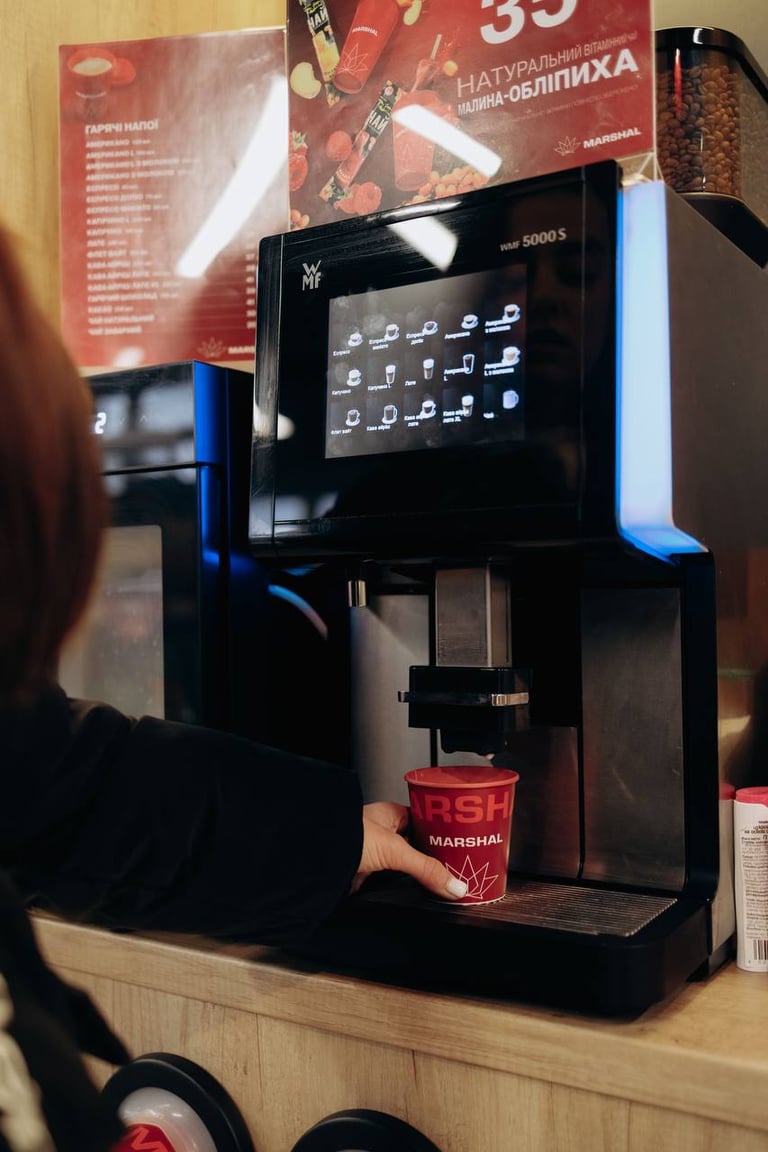
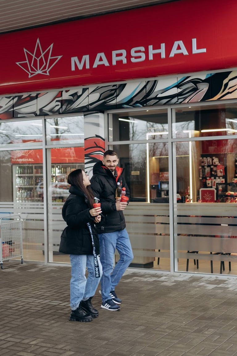
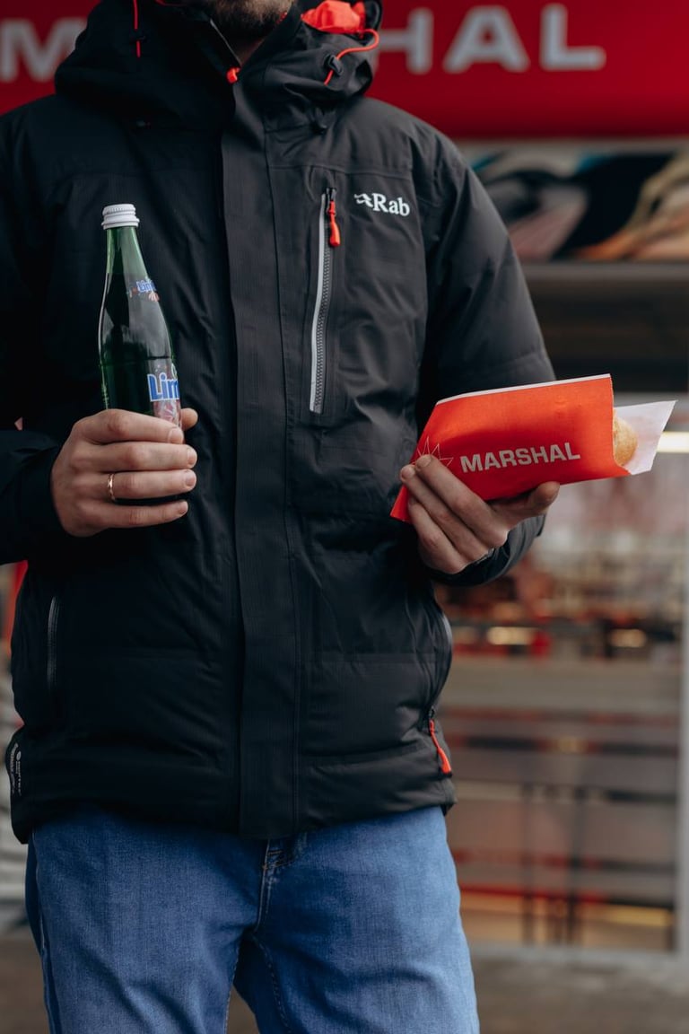
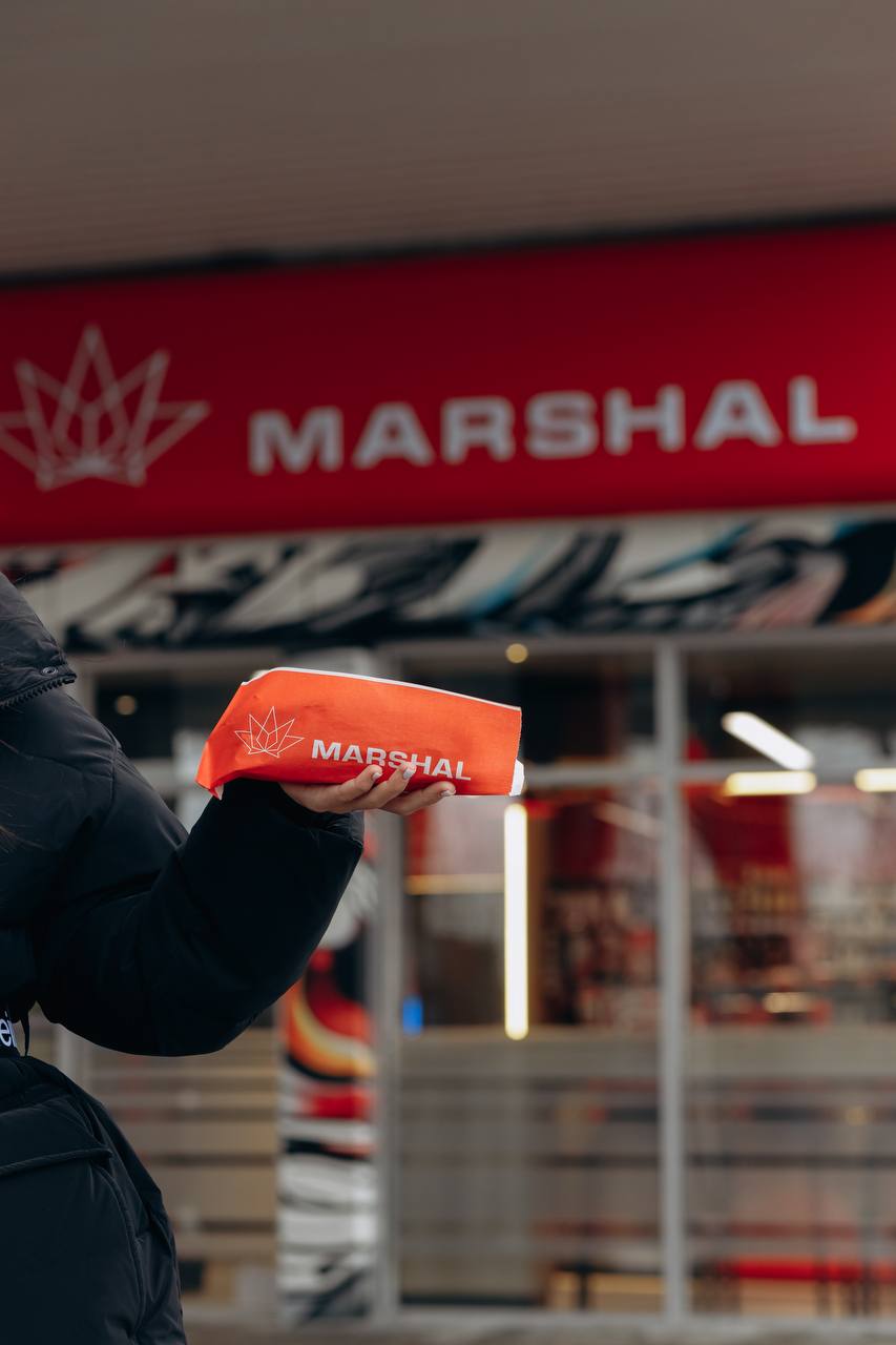
Photography & Visual Storytelling
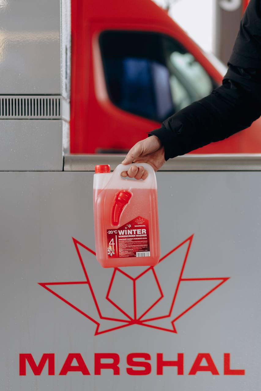
Before heading to the gas station, I carefully planned the photoshoot — creating a list of desired shots and thinking through each composition in detail. On site, I worked with models to capture natural, lively moments that reflect the Marshall brand’s spirit and customer experience. Alongside lifestyle photography, I also took product and subject shots to be later used in the app’s onboarding and promotional materials.


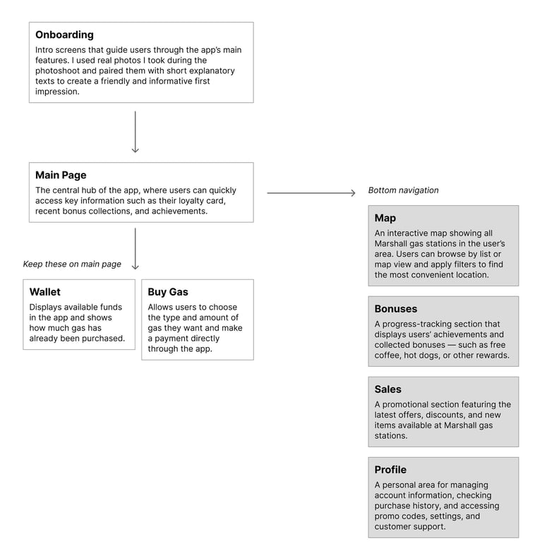
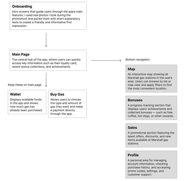
App Strcture
To define the app’s structure, I organized a call with key stakeholders to discuss the core functionality and user journey. Together, we outlined the main sections and decided which features should be included in the bottom navigation and which should remain accessible from the main page. Based on this discussion, I created a sitemap that reflects the app’s logic, helping ensure a clear and intuitive navigation flow for users.
Icons & Illustration
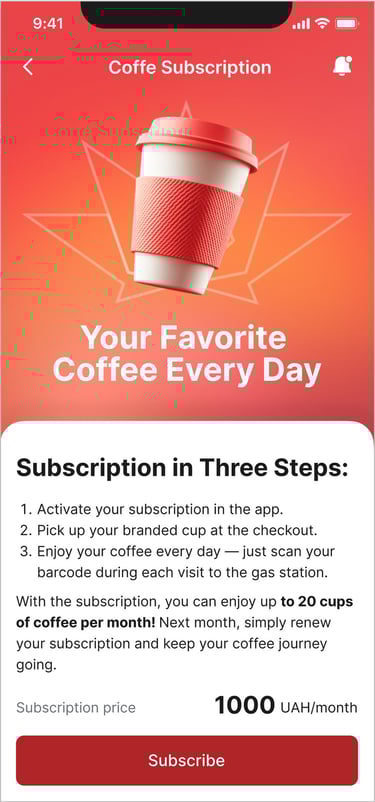
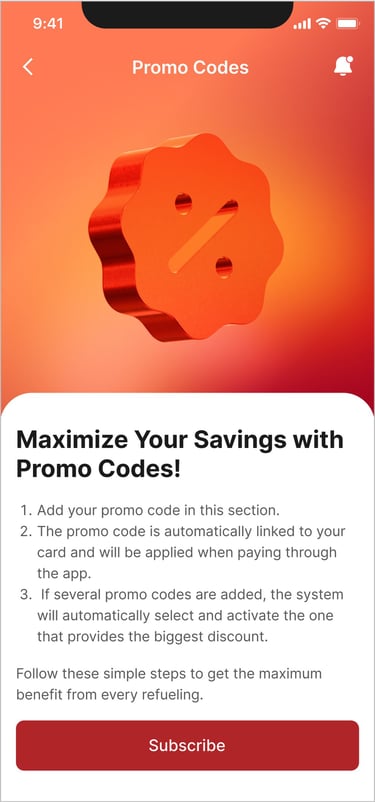


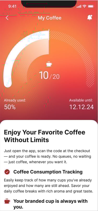
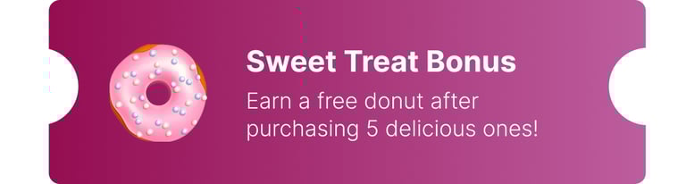

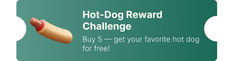
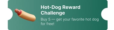
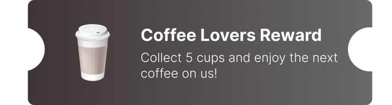

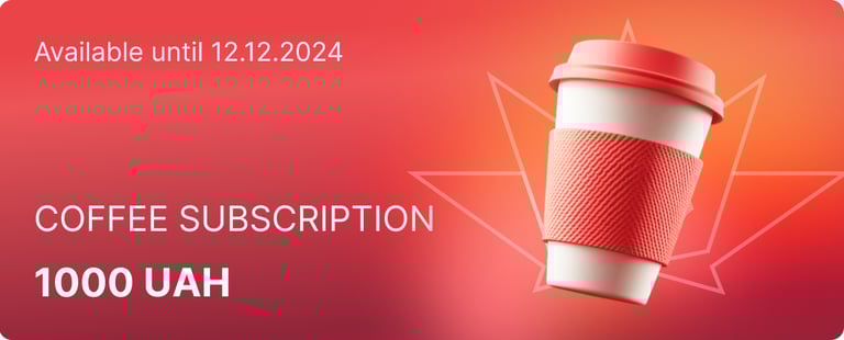

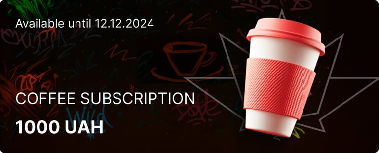

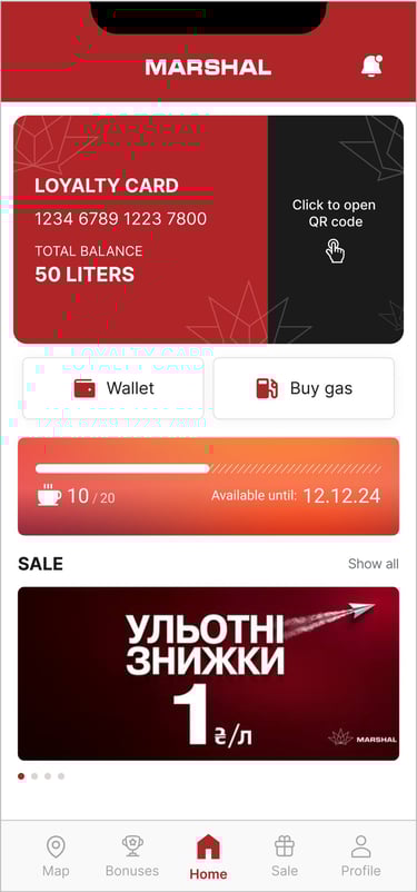
To make the interface more engaging and visually appealing, I created a set of custom illustrations and icons for different sections of the app — including cards, promo codes, and bonus tracking. These visuals were carefully integrated into the user interface to enhance recognition, support navigation, and give the app a more friendly and distinctive character.
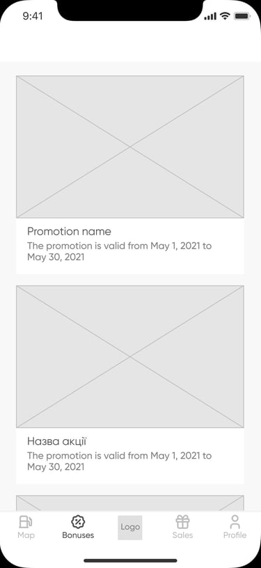
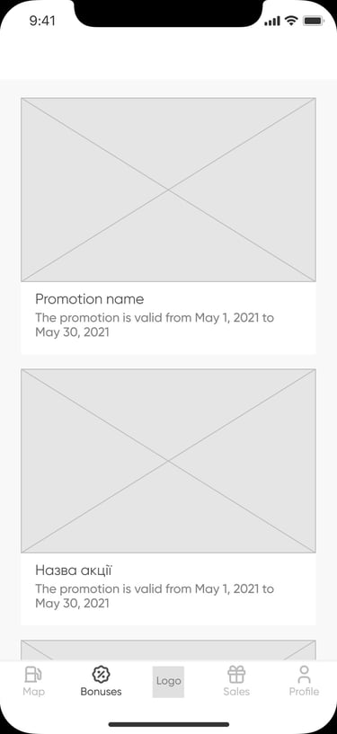
Prototypes
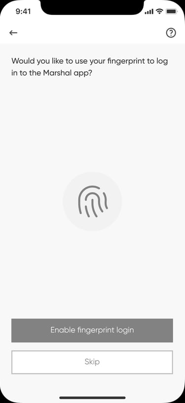
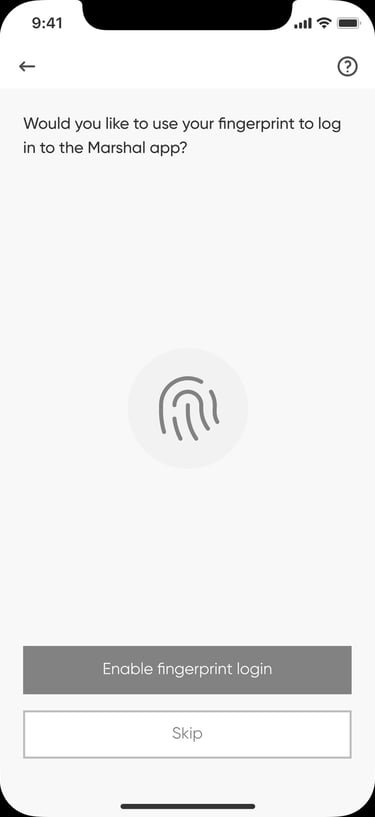
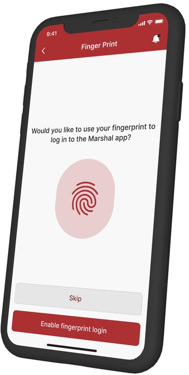
To ensure a smooth and intuitive onboarding experience, I designed interactive prototypes for the app’s key screens. These prototypes allowed stakeholders to preview the user flow early, validate ideas, and refine the onboarding process before moving into full development.
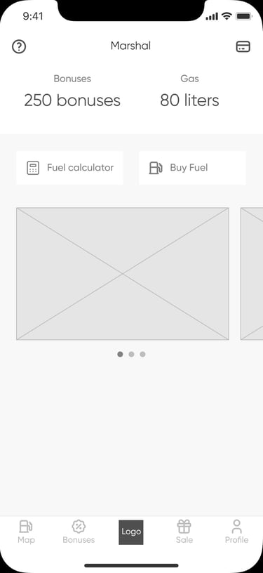
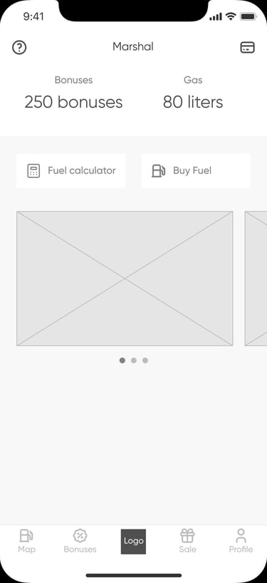
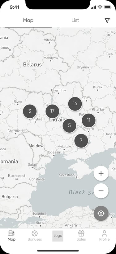
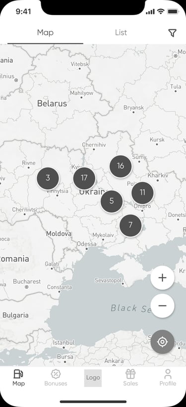
User Interface
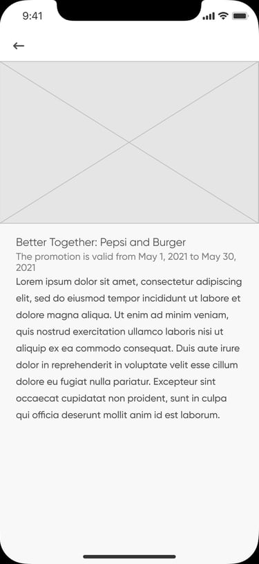
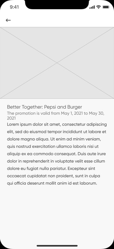
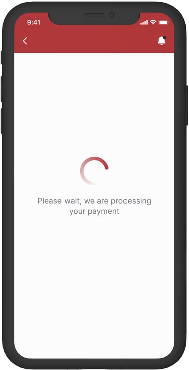
In this section, I’m showcasing the ready-for-development designs of the app’s core user interface screens. These layouts demonstrate the final visual style and overall structure of the product — combining functionality with a clean, modern look to ensure a smooth and intuitive user experience.


Conclusions & Reflextion
What Was Done
Throughout this project, I developed the core product experience from concept to polished interface — including prototypes, user flows, and high-fidelity UI designs. I also created a custom illustration and icon set, which helped build a cohesive and engaging visual identity across all app screens.
✅
⏳
What Could Be Improved with More Time
With more time, I would focus on conducting additional user testing to collect insights on real user behavior and further refine the app’s usability. Based on these findings, I would plan iterative improvements and new feature additions, ensuring the app continues to evolve according to users’ needs and expectations.