
Ework
Design System · Two Platforms · Web + Mobile · 2022-2024
What I did
Design System Extension
When I joined, the design system was in poor shape — inconsistent patterns, no shared source of truth. I rebuilt it properly with tokens and spacing rules, giving both products a real foundation to build on instead of one-off components.
Ownership
SAT was entirely my project, end to end. On Verama, I was the lead designer, directing two other designers while owning the key decisions myself.
Research & Design
Interviews with seven recruiters shaped SAT's navigation and candidate tracking. For Verama, I ran a mixed-methods survey — open-ended and select-one questions — with freelancers already using the platform, to understand where time tracking and payment were falling short for them. Both products shipped as development-ready web and mobile screens.
Ework Group is a staffing and talent solutions company managing consultants on behalf of over 500 client companies across 50 countries. I designed two connected products there: SAT, an internal tool for recruiters tracking candidates across client accounts, and Verama, the consultant-facing marketplace for finding work, tracking time, and getting paid.
When I joined, Verama's design was inconsistent and undocumented — no tokens, no shared components, everything built ad hoc. I audited it first, since SAT didn't exist yet, then defined the token system: colors, spacing, typography.
I built the core components in Figma independently, not tied to either product yet — then used them screen by screen while building SAT from the ground up. Once SAT was live and the system had proven itself in a real product, I retrofitted the same system back into Verama.
I founded the system and remained its primary decision-maker throughout — approving and governing every addition. Two other designers later helped implement and extend it in Verama, but the system's direction stayed mine to call. Documentation lived in ZeroHeight, synced with Storybook, so the system stayed usable as more people built on top of it.
Design System Extension


Part One — SAT
The first audience: recruiters juggling candidates across multiple of client companies.
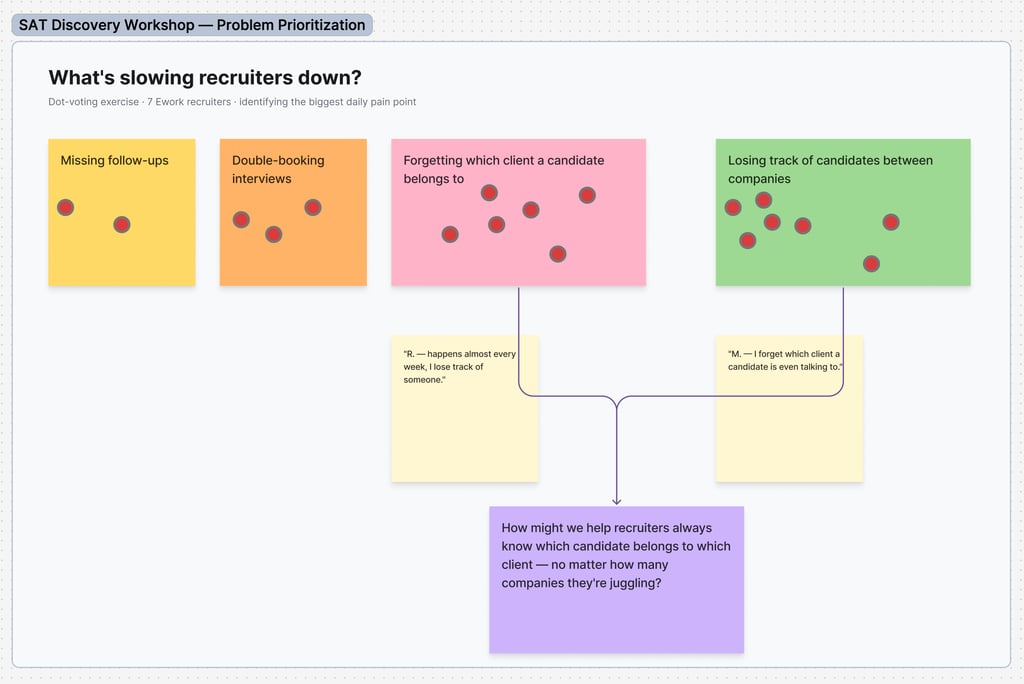
I ran a two-hour workshop with 18 of Ework's recruiters, opening with a quick icebreaker (a round of memes, just to loosen people up) before asking everyone to walk me through what actually happens when a candidate applies — their real day-to-day process, in their own words. From there, I laid out a set of potential problems — missing follow-ups, forgetting which client a candidate belonged to, double-booking interviews, losing track of candidates between companies — and had the group dot-vote on FigJam to surface what actually hurt the most. Losing track of candidates between companies and forgetting which client they belonged to came out clearly on top. I reframed those into "How might we" statements to keep the group focused on the problem before jumping to solutions, then opened it up to free discussion.
The recurring ask was simple: an easy way to switch between companies and between job postings within a single company — several people described wanting something like tabs or a switcher. We closed with each person naming the one thing they most wanted from the new system, plus a quick retro on the session itself. The scale of the problem became clear from the numbers that came out of it: recruiters were juggling requests from 2–3 client companies at once, and losing 1–3 hours a day to manual tracking just to stay on top of it.
Recruiter Research

Option A — Everything in one screen
Concept Testing


This version followed what recruiters described almost literally: company and job posting switching lived in persistent tabs and chips at the top, with the full candidate list and a status filter always visible below. It matched what people asked for in interviews — nothing hidden, no extra clicks to see where you were. The tradeoff was screen real estate: as soon as a recruiter was juggling more than 3–4 companies, that tab row would need to scroll or wrap, and the "everything visible" promise started to compete with the actual candidate data underneath it.
Option B — Left-hand navigation, grouped drill-down
This was my alternative to what recruiters had literally asked for: a collapsible sidebar listing companies, each expandable to its open job postings, so a recruiter picks a company → job before ever seeing candidates. It cost an extra step compared to Option A, but it kept the workspace uncluttered and scaled cleanly regardless of how many client companies someone was managing — the exact ceiling Option A ran into.
Testing both head-to-head, 70% of recruiters preferred Option B — the structure I'd proposed rather than the one they'd described in interviews. It's a useful reminder that what people ask for in research is a description of their pain, not necessarily the right shape for the fix; the drill-down solved the same "where am I" anxiety without the persistent-tab tradeoff, once they actually used it instead of just talking about it.
Clicking a candidate card opens a full-screen view with everything a recruiter needs to make a decision in one place — the same fit-comparison table from the card, plus cover letter, CV, portfolio link, and the candidate's answers to the application questions, with a match-percentage stepper up top so the overall score isn't lost among the details.
For the document links, I deliberately chose "open in a new tab" over a direct download. Recruiters aren't archivists — they need to review a CV once, decide, and move on, not accumulate dozens of downloaded files cluttering their computer. Opening in a new tab lets them review and download only the ones they actually want to keep. The call-to-action is a single, prominent email button rather than a fuller contact card: when I asked recruiters in interviews how they actually communicate with clients, the answer was consistently "directly through email" — so the button opens straight into their default mail client rather than a chat widget or in-app messaging system they don't use for this.
Candidate Detail View


A recruiter's biggest complaint in research was losing track of which client company a candidate belonged to. The system solved this structurally, not visually: a supplier (candidate/consultant) exists as one record, and each client relationship carries its own independent status. The same person can be "Pending" with one company and "Active" with another, with no duplication of their profile:
Each client relationship carries its own status (Pending, Active, Closed) — visible side-by-side in the list, not buried in separate views
A "+N" indicator surfaces additional relationships beyond what fits in the row, so recruiters get the full picture without opening the profile
A separate account-level flag ("Private") sits apart from any single company relationship — a person-level attribute, distinct from a relationship-level one
One person, many client relationships


Permissioning wasn't just "admin vs. everyone else." Each client company (tenant) assigns its own users named roles — Admin, PMO, Hiring Manager, Operational Buyer, Viewer, Reports User — and those roles determine not just what a person can do, but which specific reports they can see. A cycle-time dashboard might be scoped to PMO + Hiring Manager only; a benchmark report might go wider. Tenant admins manage this from a dedicated screen, not buried in general settings.
Named, tenant-scoped roles: Admin, PMO, Hiring Manager (HM), Operational Buyer (OB), Viewer, Reports User
Each report — not just each user — carries its own role scope, shown directly in the reports table
Reports can be toggled Active/Inactive per tenant independently of who's allowed to see them
Permission tiers that scale down to individual reports


Part Two — Verama
The same system needed to work for a second audience — not recruiters managing candidates, but the consultants themselves.
I ran a mixed-methods survey — open-ended and closed-ended questions — with 200 freelancers already using the platform, to understand where the experience was breaking down.
Research
Payment timing was confusing. Freelancers worked one week and got paid partway through the following week — but the wording around this schedule wasn't clear, so people frequently didn't understand when money was actually coming.
Job applications disappeared into a black hole. Freelancers applied to jobs and often never heard back — with no way to track what they'd applied to, where each application stood, or who had gone quiet. People specifically asked for a visual way to see their application pipeline: applied, interviewed, technical round, rejected, ghosted — something no competing platform offered at the time.
Freelancers wanted community, not just a marketplace. Many were also looking for standard full-time work, not just gigs — and wanted a space to exchange experience with peers. This led to Verama+, a hybrid between a blog and a forum: helpful articles alongside a space to connect and share experience
Three findings stood out:
Verama ran on the same design system as SAT, extended and applied as the product evolved — I worked alongside other designers to grow the system while adapting it to Verama's specific needs, rather than treating it as a separate build from scratch.
The design cycle followed a consistent path: prototype, present the idea, defend the reasoning to leadership, then move to high-fidelity design once direction was approved — followed by development handoff.
One decision worth calling out: my first proposal for application tracking was a Kanban-style board — cards moving automatically through Applied, Interview, Technical Interview, Hired, or aging into Ghosted if a company went silent. Leadership pushed back — the automatic status transitions were a much bigger engineering lift than the visual itself. Rather than dropping the idea, we scoped it down: ship a simpler card list first, giving freelancers a way to see what they'd applied to without losing track — the real pain point — and treat the full automated board as a future iteration once the underlying tracking logic existed to support it.
Design & Delivery


SAT staff could view and act as a specific client user directly from that user's profile, then log out back into their own session — changes preserved. Rather than needing separate credentials or backend access to troubleshoot, support could just step into the user's shoes. A persistent banner stayed on screen the whole time, so there was no ambiguity about whose account was being acted in.
One button from any user profile: "Login on behalf"
A persistent "You are logged on behalf of [name]" banner for the entire session — impossible to forget you're impersonating
Logging out returns to the SAT user's own session; anything changed while impersonating is saved
"Login on behalf": support without losing track of whose account you're in


SAT replaced spreadsheets, email threads, and an unused legacy tool for recruiters juggling 2–3 clients at once and losing 2–3 hours a day to manual tracking. Testing two navigation concepts head-to-head showed 70% preferred the structured drill-down over what recruiters had described in interviews — proof the fix beat the literal ask.
Verama surfaced three pain points through a 200-freelancer survey: confusing payment timing, no way to track applications, and demand for community beyond the marketplace. That led to a scoped-down application tracker and Verama+, a blog/forum hybrid for freelancers.
Outcome
What Was Done
Built a design system from scratch, then two full redesigns from it for different audiences. SAT: seven recruiter interviews shaped navigation testing, document handling, and a companion mobile app for COVID-era conditions. Verama: survey findings shaped a scoped application tracker and a new community feature, built alongside other designers extending the same system.
What Could Be Improved
The biggest gap, true for both: no analytics access — no way to see how people actually used either product after launch. Every decision was grounded in real research, but none of it was checked against real usage afterward.
Beyond that: ongoing usability testing on SAT instead of stopping at initial research, plus reporting features giving recruiters pipeline visibility over time. On Verama, validating the full Kanban board once engineering could support the automation.